


公式サプライヤー
公式および認定ディストリビューターとして200社以上の開発元から正規ライセンスを直接ご提供いたします。
当社のすべてのブランドをご覧ください。
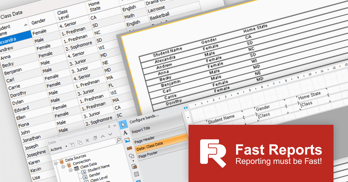
FastReport .NET Ultimate is a comprehensive reporting solution for developers working within the Microsoft .NET ecosystem. It supports the creation, design, and delivery of rich, interactive reports across Windows Forms, ASP.NET, MVC, and .NET Core applications. The Ultimate edition includes server deployment capabilities and extensive export options, such as PDF, Excel, Word, and HTML. It connects to various data sources, including SQL databases and business objects, providing flexibility for enterprise-level reporting. With the integrated FastReport Online Designer, users can edit reports directly in their browsers, enabling efficient collaboration and modern, full-featured report design across both desktop and web platforms.
The latest FastReport .NET Ultimate update introduces support for Google Sheets as a data source, allowing reports to connect directly to cloud-based spreadsheets. It enables developers and data professionals to work with up-to-date information without manual data transfers, making it easier to incorporate shared or frequently updated datasets into reports. It simplifies access to external data while maintaining the familiar reporting experience, making it particularly useful for teams already relying on Google Sheets for data management.
FastReport .NET Ultimate is licensed per named user and is available as a perpetual license with a one-year subscription for updates and support. See our FastReport .NET Ultimate licensing page for full details.
For more information, visit our FastReport .NET Ultimate product page.
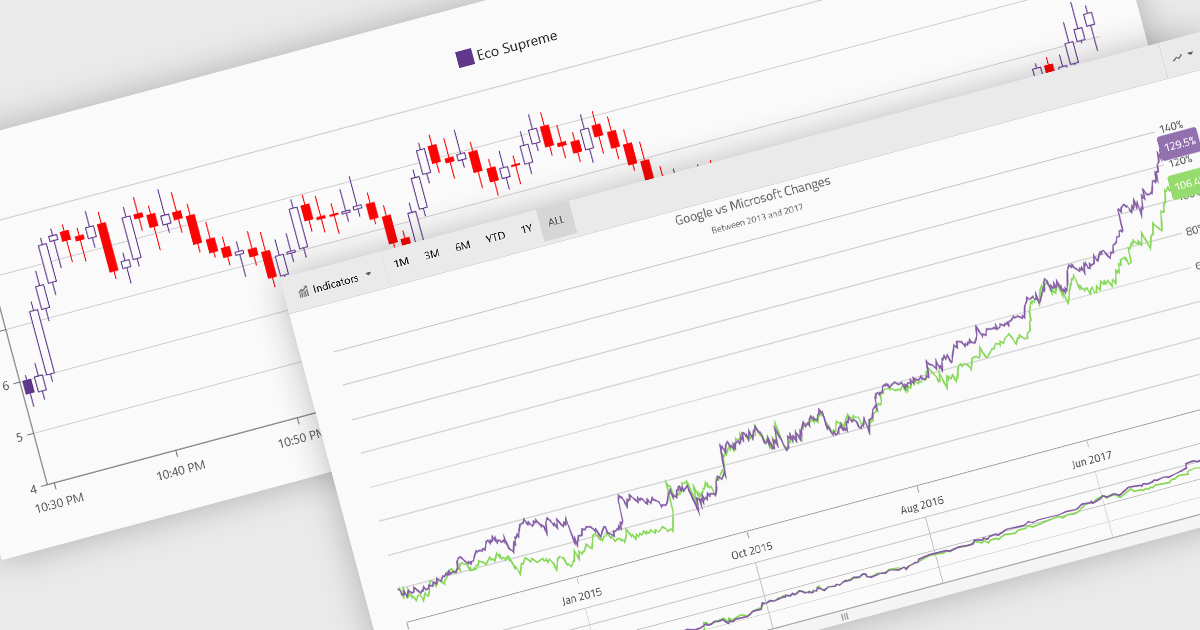
Financial charts are specialized visualizations designed to represent market data and price movements over time. Commonly used in trading platforms and analytical applications, these charts help users interpret open, high, low, and close values, as well as trends and volatility. By providing standardized financial visualizations, charting components enable developers to deliver tools that support technical analysis, decision-making, and real-time data exploration in finance-focused applications.
Common features include:
For an in-depth analysis of features and price, visit our Blazor charts components comparison.
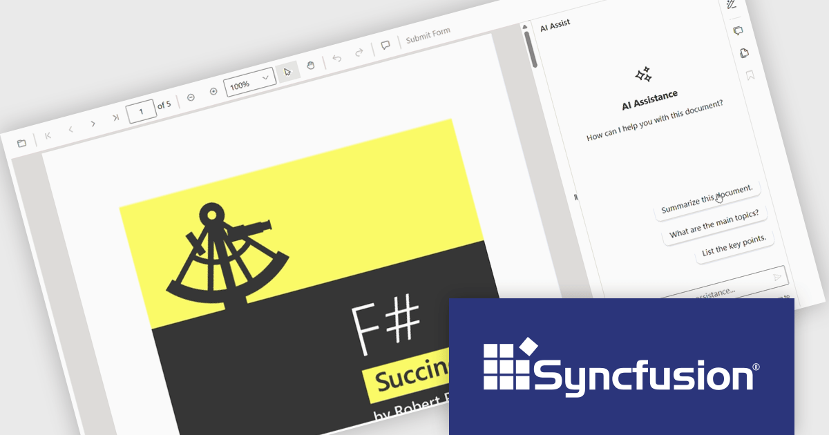
The Syncfusion Essential Studio PDF Viewer SDK is a high performance solution that enables developers to integrate advanced PDF viewing capabilities into web, desktop, and mobile applications. It supports features such as document navigation, annotations, form filling, digital signatures, and collaborative review, allowing users to interact with PDF content efficiently. Designed for reliability and smooth rendering of complex documents, it provides a consistent experience across platforms.
The Syncfusion Essential Studio PDF Viewer SDK 2026 Volume 1 update introduces a document summarizer that enhances how developers deliver efficient document interaction by integrating AI-generated summaries and contextual question-answering directly within PDF viewing applications. This feature enables end users to quickly extract key information and insights from large or complex documents, reducing time spent navigating content and improving overall productivity.
To see a full list of what's new in Syncfusion Essential Studio PDF Viewer SDK 2026 Volume 1, see our release notes.
Syncfusion Essential Studio PDF Viewer SDK is licensed per developer on a one year timed subscription basis, with runtime royalty free redistribution included when the subscription is current, and includes one year of unlimited technical support and updates. See our Syncfusion Essential Studio Spreadsheet Editor SDK licensing page for full details.
Learn more on our Syncfusion Essential Studio PDF Viewer SDK product page.
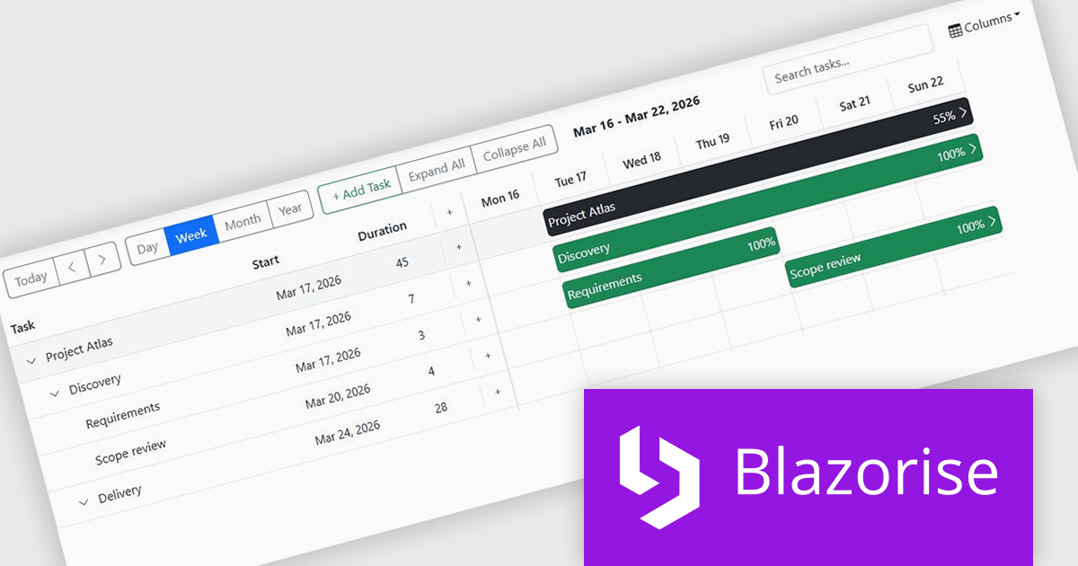
Blazorise is a versatile component library that empowers developers to build modern and feature-rich web applications using Blazor, a client-side web development framework from Microsoft. It offers a comprehensive collection of user interface components, including buttons, forms, charts, and navigation elements, all built with accessibility and responsiveness in mind.
The Blazorise 2.0.3 update introduces a Gantt component that enables developers to implement advanced project planning and timeline visualization directly within their applications, reducing the need for custom development or third party tools while supporting complex scheduling scenarios through features such as task editing, hierarchical data structures, dependency management, filtering, and drag and drop interactions, all within a consistent and theme aligned UI framework.
To see a full list of what’s new in version 2.0.3, see our release notes.
Blazorise is licensed per developer and includes a 1 year subscription for updates and support. Professional, Enterprise, and Enterprise Plus editions are available, each offering tailored levels of support and service to meet varying business needs. See our Blazorise licensing page for full details.
For more information, visit our Blazorise product page.
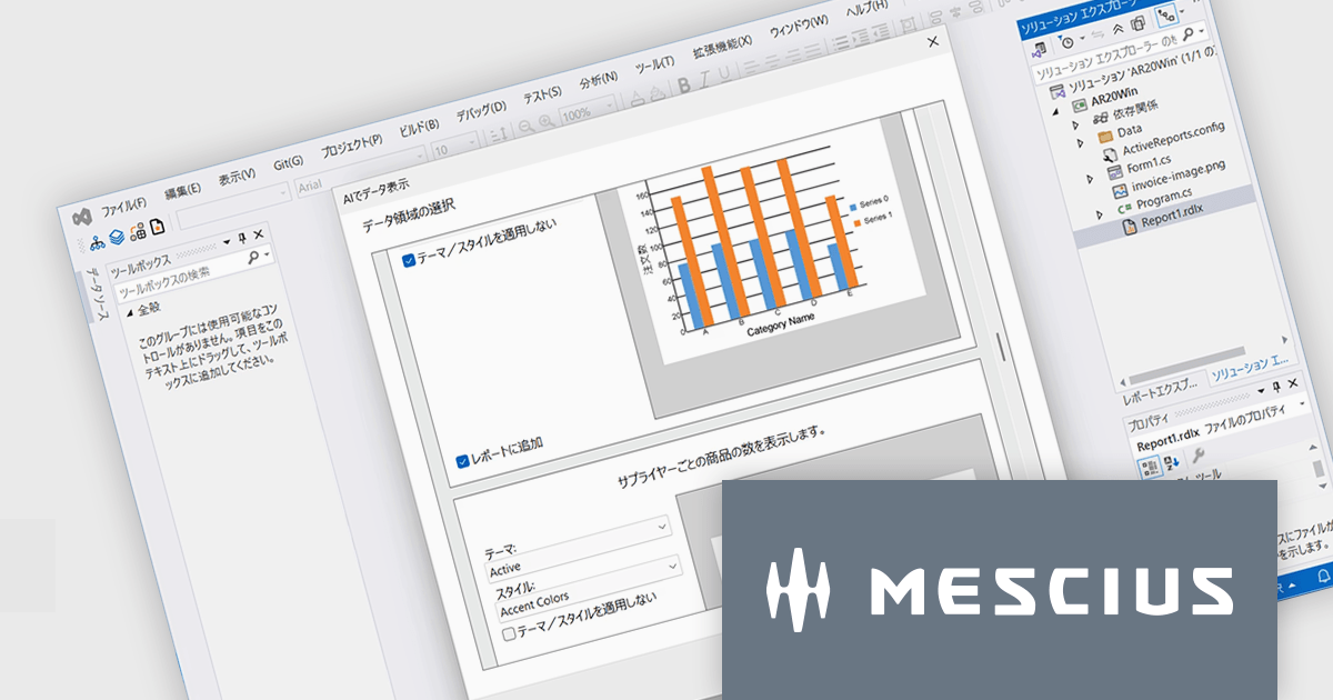
ActiveReports for .NETは、Visual Studio上で帳票アプリケーションを開発できる.NET開発コンポーネントです。Windowsフォーム、WPF、ASP.NET、ASP.NET Core、Blazorの5つのプラットフォームをサポートし、レイアウトや書式といった外観デザインの設定から、データ接続、印刷およびPDFへの出力設定まで、帳票開発に必要なあらゆる機能を備えています。
ActiveReports for .NET 20.0Jでは、AIを活用した帳票開発支援機能が強化され、設計工程の効率化が大きく進みました。主な特徴の一つは、帳票画像をもとにレイアウトを自動生成する機能です。画像を解析し、テキストや罫線、各種コントロールを適切に配置することで、従来手作業で行っていた設計の初期工程を短縮できます。さらに、AIがデータ構造を理解し、レポート作成時の設定を提案する機能も追加されました。なお、最新の.NET 10およびVisual Studio 2026にも対応しており、最新の開発環境で帳票アプリケーションを構築できるようになりました。
20.0Jでの新機能一覧は、リリースノートを参考ください。
本製品のライセンスは、開発者ごとに付与されるユーザーライセンスで、対象開発者は最大3台のマシンにインストール可能です。本製品の機能を組み込んで開発したクライアントサイドアプリケーションはランタイムライセンスは不要です。ただし、サーバーサイドアプリケーションを運用環境へ配布の際には”コアサーバーライセンス”が必要です。なお、年間保守サービスが付属しており、無償バージョンアップや日本語によるE-mail技術サポートを無制限に受けることができます。詳細は、ActiveReports for .NETのライセンスページをご参照ください。
ActiveReports for .NETの製品詳細及び販売情報は、下記の各エディション別の専用ページをご参考ください。
電話: (888) 850 9911
Fax: +1 770 250 6199


