


公式サプライヤー
公式および認定ディストリビューターとして200社以上の開発元から正規ライセンスを直接ご提供いたします。
当社のすべてのブランドをご覧ください。
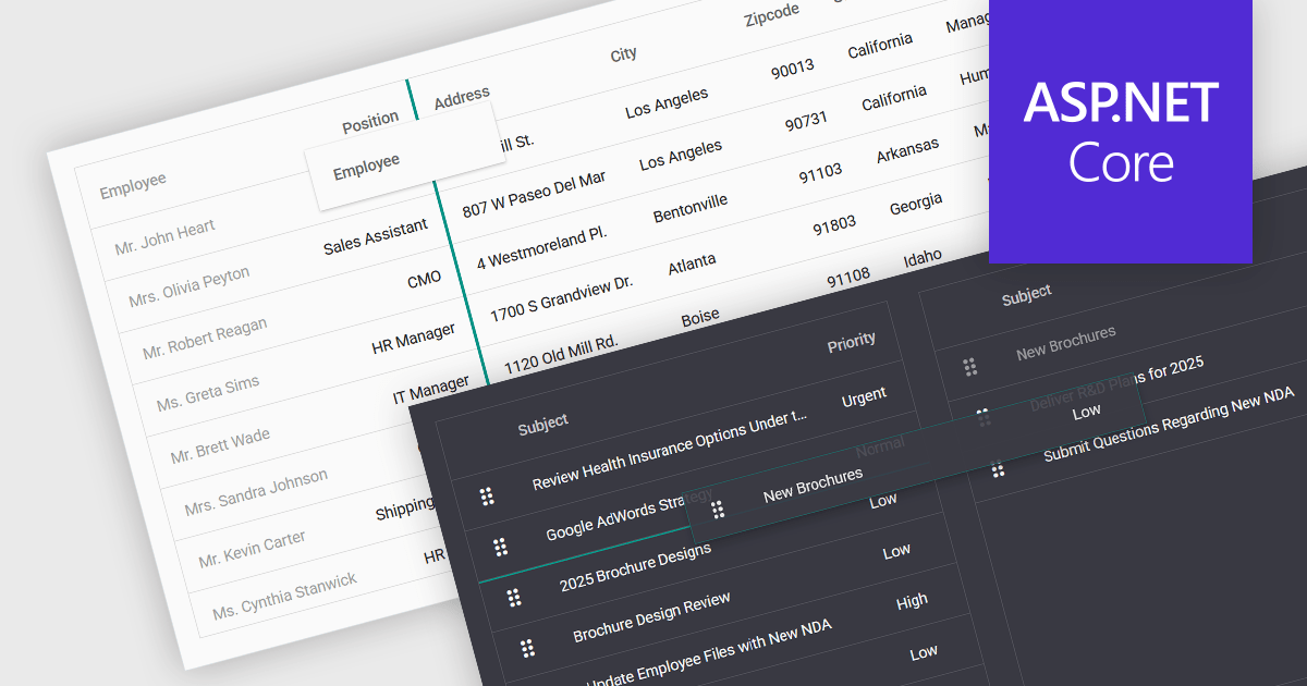
Drag-and-drop functionality in a data grid allows users to interactively move, reorder, or transfer data elements within the grid or between different grids using a simple click-and-drag motion. This feature provides an intuitive way to manipulate data without requiring complex commands or manual input, improving both efficiency and usability. It is particularly beneficial in applications that require frequent adjustments to data structures, such as dashboards, reporting tools, and data management systems. By enabling users to customize the grid layout dynamically, drag and drop functionality enhances productivity, and ensures greater flexibility when handling data.
Several ASP.NET Core grid controls support drag-and-drop functionality, including:
For an in-depth analysis of features and price, visit our ASP.NET Core grid controls comparison.
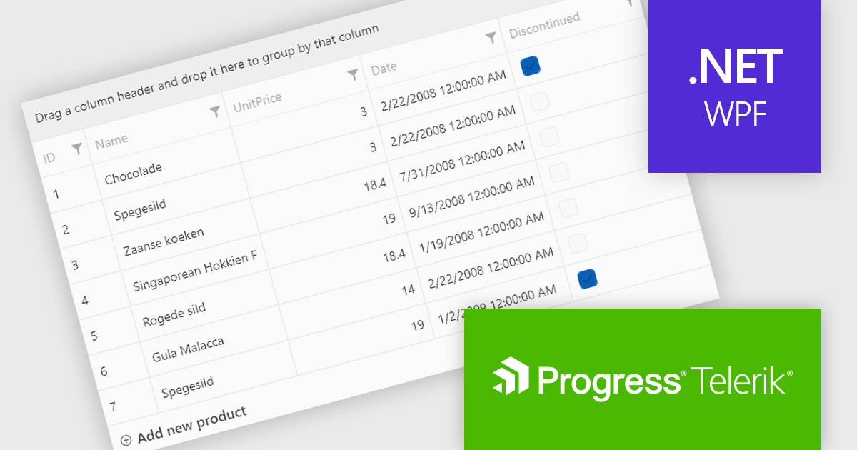
Telerik UI for WPF is a robust suite of over 150 user interface components designed for Windows Presentation Foundation, enabling developers to build modern, high-performance desktop applications. It includes controls like data grids, charts, schedulers, and editors, optimized for seamless integration and support for MVVM (Model-View-ViewModel) patterns. With features like built-in theming, responsive layouts, and customizable styling, it simplifies the creation of visually appealing, intuitive interfaces. Ideal for enterprise-grade or consumer-facing apps, Telerik UI for WPF accelerates development while ensuring professional-quality results.
The Telerik UI for WPF 2025 Q1 (2025.1.211) update enhances RadGridView with a new filtering mode that supports complex expressions, providing developers with greater control and precision when working with data. This feature introduces an intuitive Filter Editor that combines a clear Data Filter View for visualizing applied criteria with the powerful RadDataFilter control for adding, editing, and managing filters. Key usability enhancements, such as optional wrapping for readability, quick enable/disable options for filters, and streamlined access to editing tools, make it easier to implement dynamic, customizable filtering experiences in applications, empowering developers to deliver highly responsive and user-centric interfaces.
To see a full list of what's new in 2025 Q1, see our release notes.
Telerik UI for WPF is licensed per developer and has two licensing models: an annual Subscription License and a Perpetual License. The Subscription license provides access to the latest product updates, technical support, and exclusive benefits for a flat annual fee, and must be renewed to continue using the software. The Perpetual license is a one-time purchase granting access to the current released version and includes a one-year subscription for product updates and technical support. After this initial period, users can choose to renew the subscription element to continue receiving updates and support; otherwise, they may continue using the installed version available during their active subscription term but will forgo future updates and support. See our Telerik UI for WPF licensing page for full details.
Telerik UI for WPF is available individually or as part of the following products:
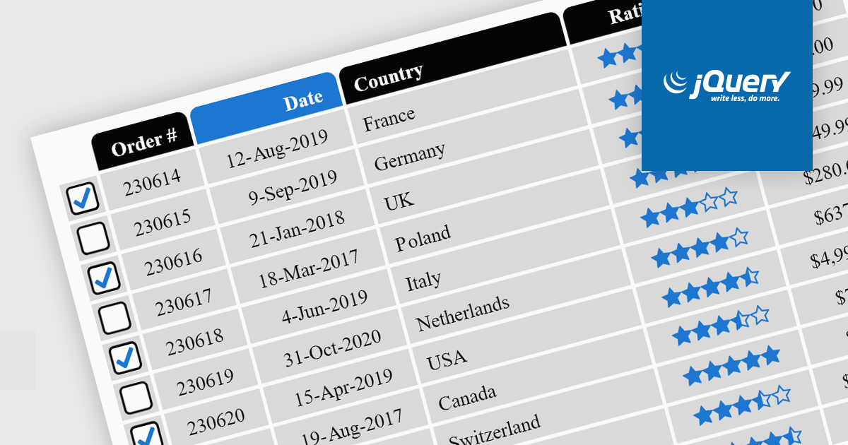
Cell types in Grid components are specialized configurations that define how data is displayed, edited, and interacted with within a grid or table structure. They allow developers to tailor the presentation and functionality of each cell to better match the type of data it contains. By specifying cell types such as text, numeric, date/time, and more, Grid components can provide intuitive controls and formatting automatically, streamlining data entry and reducing errors.
Common features include:
For an in-depth analysis of features and price, visit our jQuery grid components comparison.

Data grids are essential components in modern user interface (UI) suites, enabling developers to display, manage, and manipulate large sets of data efficiently. They provide features such as sorting, filtering, grouping, and pagination, which enhance the user experience and improve data navigation. Advanced data grids also support customizable templates, responsive layouts, and integration with various data sources, making them highly versatile for enterprise-level applications.
Several Blazor UI suites offer data grid components including:
For an in-depth analysis of features and price, visit our Blazor UI suites comparison.
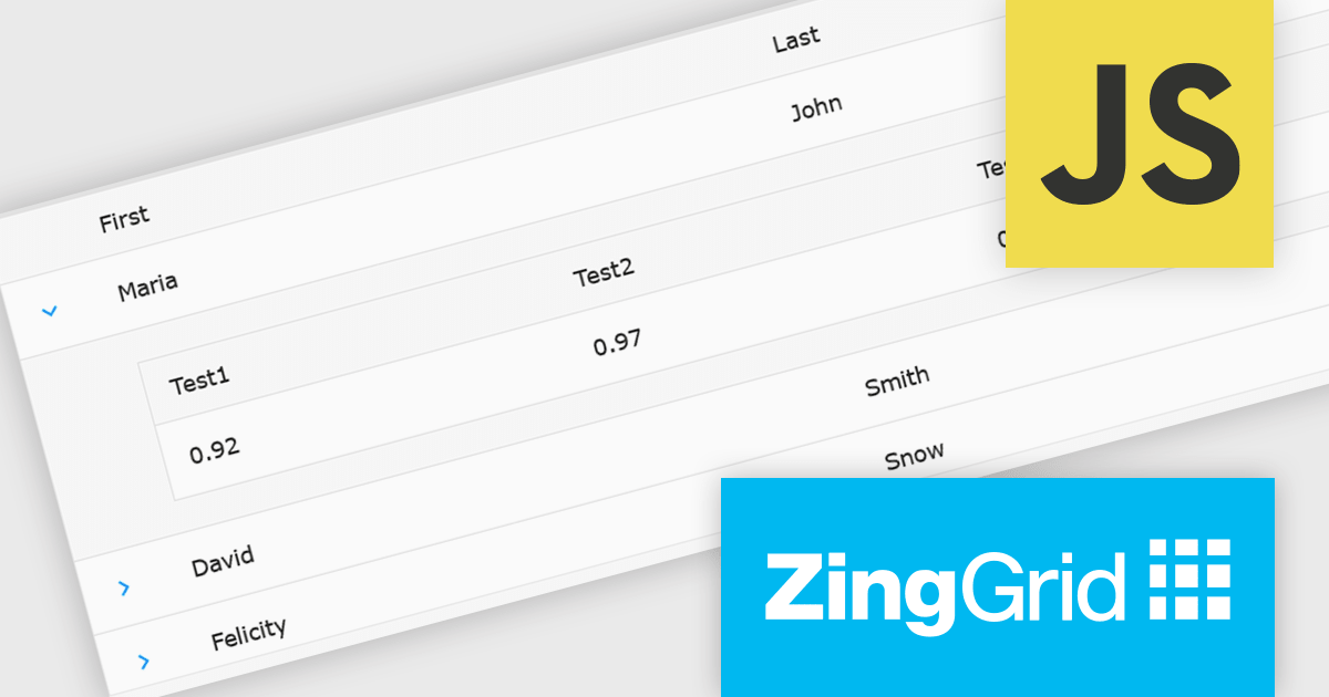
ZingGrid is a JavaScript library that simplifies the creation of interactive data tables and grids within web applications. Utilizing modern web components and focusing on performance and responsiveness, ZingGrid allows developers to implement features like searching, filtering, pagination, and in-line editing with minimal coding. This empowers efficient data visualization and manipulation for users, making it a valuable tool for web development.
The ZingGrid 2.0.0 release adds new Row Details feature that enhances data presentation by allowing users to expand individual rows and reveal supplementary information. This functionality provides a clean and organized way to display additional data without cluttering the main grid view. Whether you are editing, filtering, searching, or sorting your data, the expanded/collapsed state of each row is intelligently preserved, even across pages. This allows users to maintain context and easily access detailed information without losing their place or having to re-expand rows after interacting with other grid functionalities.
To see a full list of what's new in version 2.0.0, see our release notes.
ZingGrid is available as either a Single-Domain Website or Multi-Domain SaaS license. See our ZingGrid licensing page for full details.
For more information, visit our ZingGrid product page.
電話: (888) 850 9911
Fax: +1 770 250 6199


