


公式サプライヤー
公式および認定ディストリビューターとして200社以上の開発元から正規ライセンスを直接ご提供いたします。
当社のすべてのブランドをご覧ください。
ComponentOne Studio Enterprise is a comprehensive suite of .NET UI controls developed by MESCIUS (formerly GrapeCity) designed for building rich, interactive desktop, web, and mobile applications. It provides developers with a broad range of tools and components—including data grids, charts, reports, input controls, and advanced data visualization features—for platforms such as WinForms, WPF, ASP.NET Core, Blazor, WinUI, and .NET MAUI. The suite emphasizes performance, flexibility, and ease of integration, helping teams create consistent, feature-rich user experiences across multiple application types while maintaining a unified development approach.
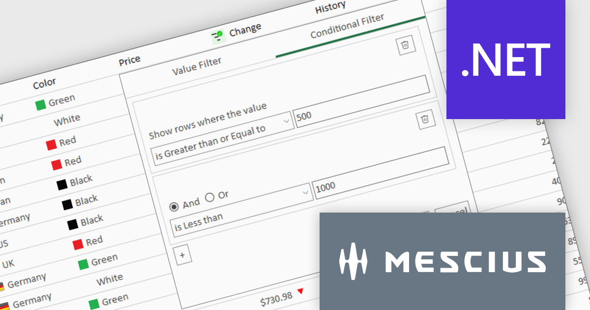
The ComponentOne Studio Enterprise 2025 v1 update introduces a redesigned column filter UI for FlexGrid in WinForms that enhances filtering precision and developer control. It supports a wider range of filter conditions, such as numeric and date ranges, duplicates, and null values, allowing for more refined data manipulation. The new interface aligns visually with modern application themes and remains backward compatible, ensuring that existing codebases can adopt the update without disruption. This improvement enables developers to implement more robust and flexible data grids in their WinForms applications.
To see a full list of what's new in 2025 v1, see our release notes.
ComponentOne Studio Enterprise is licensed per developer on a perpetual basis and includes a 12 month subscription. Priority Support is also available. See our ComponentOne Studio Enterprise licensing page for full details.
Learn more on our ComponentOne Studio Enterprise product page.
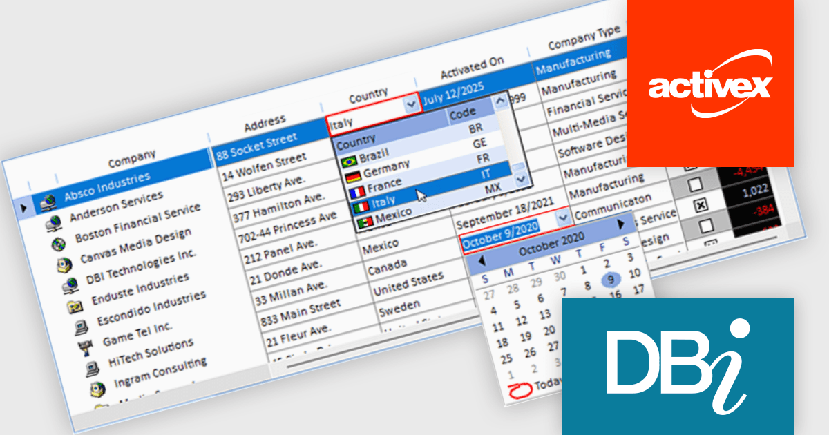
Studio Controls for COM and Studio Controls COM 64 by DBI Technologies are a set of 32-bit and 64-bit ActiveX components for building data-driven Windows applications. Both suites include controls for grids, scheduling, calendars, and UI elements, designed to integrate with environments like Microsoft Access and Visual Basic. The suite supports Windows styling and XML configuration, helping developers create professional, interactive applications across legacy and modern platforms.
The Studio Controls for COM v7.5 update introduces ctxGrid, a high performance 32 bit and 64 bit ActiveX data grid that integrates seamlessly into any ActiveX supported IDE and provides developers with formatted input controls including combo boxes and validation rules for robust data entry. It supports dynamic column manipulation such as locking, sorting and auto sizing and leverages XML driven styling and theming to ensure a consistent Windows compliant user interface while exposing a fully extensible API for implementing custom behaviors. Its lightweight architecture delivers a minimal memory footprint and rapid rendering of large datasets, enabling developers to add interactive data presentation and input functionality quickly without compromising overall application responsiveness.
To see a full list of what's new, see our Studio Controls for COM release notes and Studio Controls COM 64 release notes.
Studio Controls for COM/COM 64 is licensed per developer, royalty-free for runtime use. A one-year subscription includes support, updates, upgrades and any new controls. See our Studio Controls for COM licensing page and Studio Controls COM 64 licensing page for full details.
For more information, see our Studio Controls for COM product page and Studio Controls COM 64 product page.

Aggregation in grid components allows users to automatically compute and display summary values, such as totals, averages, minimums, and maximums, across rows or columns of data. This feature enhances the analytical capability of a data grid by offering quick insights directly within the interface, reducing the need to export data for external processing. It is particularly valuable in business intelligence dashboards, financial applications, and administrative tools where on-the-fly data synthesis is essential.
Several React grid controls offer aggregation including:
For an in-depth analysis of features and price, visit our React grid controls comparison.
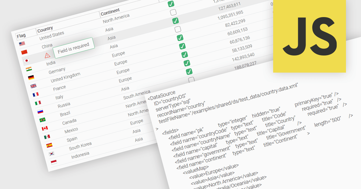
A fundamental feature in a data grid is the ability to specify that a column must be populated with values and cannot be left empty. By designating certain columns as mandatory, developers can enforce input rules that prevent users from leaving critical fields blank, such as user identifiers, product names, or timestamps. Required columns are typically enforced through validation rules that prevent the submission or processing of incomplete records, thereby ensuring the completeness and validity of data entries. This improves data integrity, reduces the likelihood of processing errors, and supports consistent business logic across applications that rely on structured datasets.
Several JavaScript grid controls allow you to set columns as required, including:
For an in-depth analysis of features and price, visit our comparison of JavaScript grid controls.
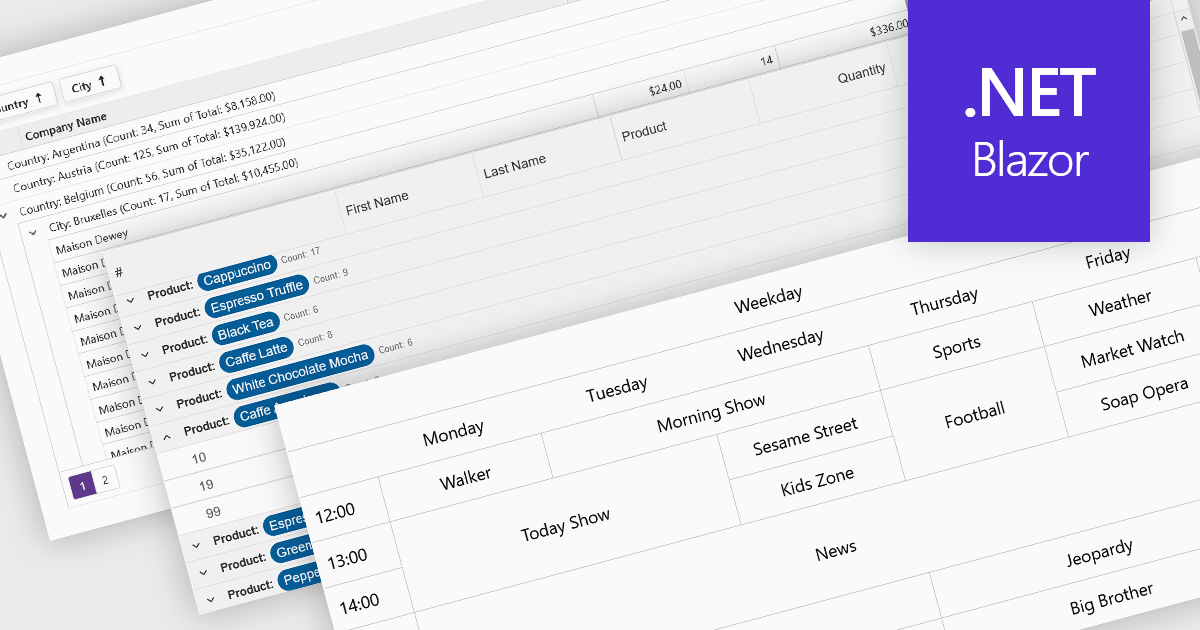
Data visualization and analysis features in grid components transform raw tabular data into structured, interpretable formats that support faster insights and decision-making. These features go beyond static display, offering dynamic ways to organize, summarize, and explore data directly within the grid interface, making it a powerful tool for both end-users and analysts.
Common features include:
For an in-depth analysis of features and price, visit our Blazor grid components comparison.
電話: (888) 850 9911
Fax: +1 770 250 6199


