


公式サプライヤー
公式および認定ディストリビューターとして200社以上の開発元から正規ライセンスを直接ご提供いたします。
当社のすべてのブランドをご覧ください。
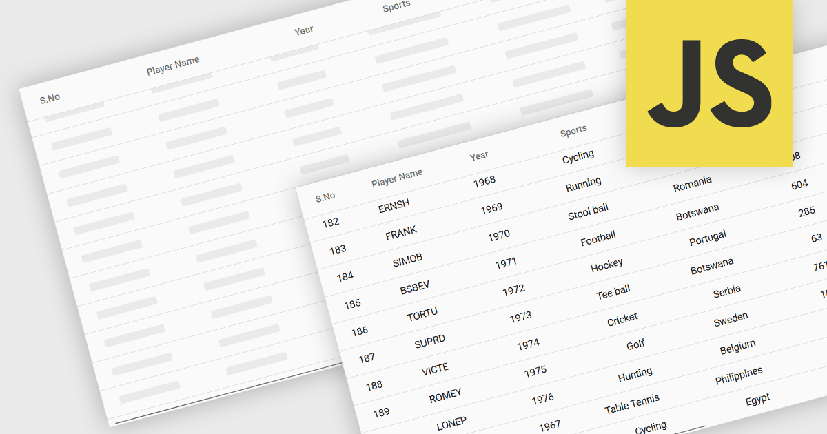
The ability to load items in a data grid as you scroll is a technique where content is rendered or fetched dynamically based on the user’s scroll position. Its purpose is to improve performance, and ultimately the user experience, when dealing with large datasets. This includes virtual scrolling, where the grid only renders rows that are currently visible in the viewport and reuses those same DOM elements as the user scrolls, and infinite scrolling (also known as endless scrolling), where additional data is loaded from a remote source in response to reaching the end of the currently displayed dataset. By minimizing the amount of data rendered or retrieved at any one time, this approach significantly reduces initial load times, improves responsiveness, and allows applications to scale efficiently.
Several JavaScript grid components allow you to load items as the user scrolls, including:
For an in-depth analysis of features and price, visit our comparison of JavaScript grid components.

Telerik UI for .NET MAUI is a robust suite of user interface components designed to simplify the creation of cross-platform applications using .NET Multi-platform App UI (MAUI). It offers a wide range of pre-built controls, including charts, grids, and navigation elements, enabling developers to build visually appealing, high-performance apps for Android, iOS, Windows, and macOS from a shared codebase. By ensuring a consistent user experience across platforms, it accelerates development and allows a focus on functionality, making it ideal for business applications, dashboards, and data-driven projects.
The Telerik UI for .NET MAUI 2025 Q2 update introduces the TreeDataGrid component, providing users with a powerful tool for presenting complex, hierarchical data in a structured, grid-based layout. By combining the features of a TreeView and a DataGrid, the TreeDataGrid enables efficient display and interaction with nested data using multiple columns, expandable rows, and customizable indentation. It supports dynamic operations such as adding or removing child items, auto-expanding nodes, and conditionally rendering expandable sections, providing precise control over data presentation and user experience.
To see a full list of what's new in 2025 Q2 (v11.0.0), see our release notes.
Telerik UI for .NET MAUI is licensed per developer and has two licensing models: an annual Subscription License and a Perpetual License. The Subscription license provides access to the latest product updates, technical support, and exclusive benefits for a flat annual fee, and must be renewed to continue using the software. The Perpetual license is a one-time purchase granting access to the current released version and includes a one-year subscription for product updates and technical support. After this initial period, users can choose to renew the subscription element to continue receiving updates and support; otherwise, they may continue using the installed version available during their active subscription term but will forgo future updates and support. See our Telerik UI for .NET MAUI licensing page for full details.
Telerik UI for .NET MAUI is available individually or as part of the following products:
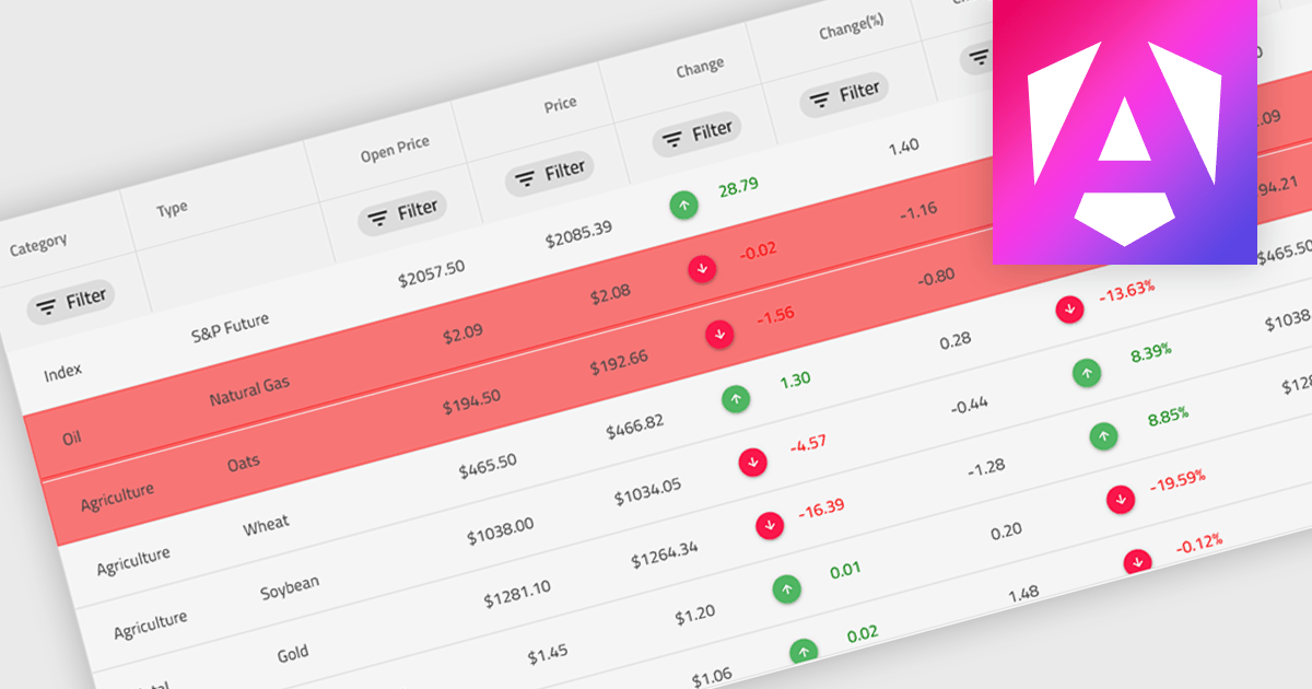
Conditional formatting in a grid refers to the dynamic application of visual styles—such as colors, icons, or font changes—to cells based on the values they contain or rules defined by the developer. This feature enables developers to visually differentiate data patterns, identify anomalies, or highlight critical values directly within a data grid without additional processing or user interaction. By presenting real-time visual cues tied to data content, conditional formatting enhances readability, supports quick analysis, and improves user decision-making, particularly in data-heavy applications where clarity and immediacy are essential.
Several Angular grid controls offer conditional formatting, including:
For an in-depth analysis of features and price, visit our comparison of Angular Grid controls.

Fixed headers in a grid component refer to the user interface feature where the header row (or rows) of the grid remains visible at the top of the viewport while the user scrolls through the content vertically. This functionality is particularly useful in data-intensive applications, as it ensures that column labels stay in view, maintaining context and readability even with large datasets. For software developers, implementing fixed headers improves usability, enhances data navigation, and supports better comprehension by eliminating the need to repeatedly scroll back to the top to interpret column values.
Several Blazor Grids offer support for fixed headers including:
For an in-depth analysis of features and price, visit our Blazor Grids comparison.
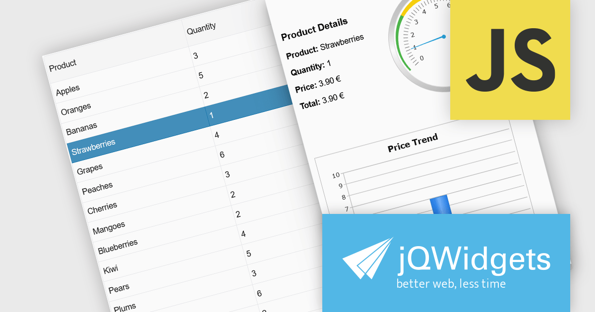
jQWidgets is a comprehensive JavaScript UI framework offering a robust collection of over 60 widgets, themes, and utilities for building professional-grade, cross-platform web applications. Built on jQuery, HTML5, and CSS, it provides extensive functionality including data grids, charts, navigation, input validation, and more. jQWidgets simplifies web development, ensuring your applications work seamlessly across desktop browsers, tablets, and smartphones.
The jQWidgets v23.0.0 release adds a new side panel feature in jqxGrid, allowing developers to add custom HTML elements directly into side panels positioned next to the grid. Whether you want to include filters, charts, summaries, help text, or interactive widgets, the side panel supports any type of content.
To see a full list of what's new in v23.0.0, see our release notes.
jQWidgets is licensed per developer and is available as a Perpetual license 1 year support and maintenance. See our jQWidgets licensing page for full details.
Learn more on our jQWidgets product page.
電話: (888) 850 9911
Fax: +1 770 250 6199


