


公式サプライヤー
公式および認定ディストリビューターとして200社以上の開発元から正規ライセンスを直接ご提供いたします。
当社のすべてのブランドをご覧ください。
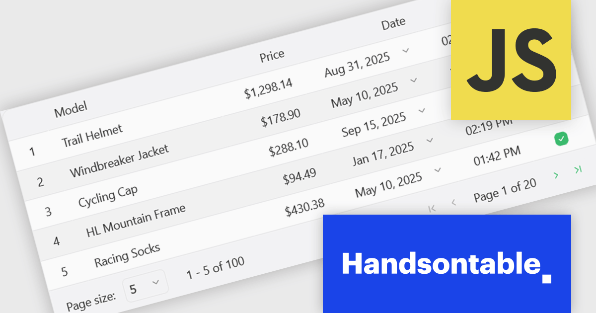
Handsontable is a JavaScript library designed to help developers build interactive data grids into their web applications. Offering a familiar spreadsheet-like interface, it allows users to edit, sort, and filter data with ease. Highly customizable and compatible with popular frameworks like React and Angular, Handsontable empowers developers to build robust data manipulation features into their web applications.
The Handsontable 16.1.0 update brings client-side row pagination, allowing users to divide large tables into smaller, more manageable chunks. This feature is especially beneficial when working with high-volume data, as it improves rendering speed and ensures smoother interaction. By enabling page-based navigation within the grid, developers can maintain a responsive user interface even as datasets scale up significantly.
To see a full list of what's new in version 16.1.0, see our release notes.
Handsontable is licensed per developer and is available as an Annual or Perpetual license with 1 year support and maintenance. See our Handsontable licensing page for full details.
For more information, visit our Handsontable product page.
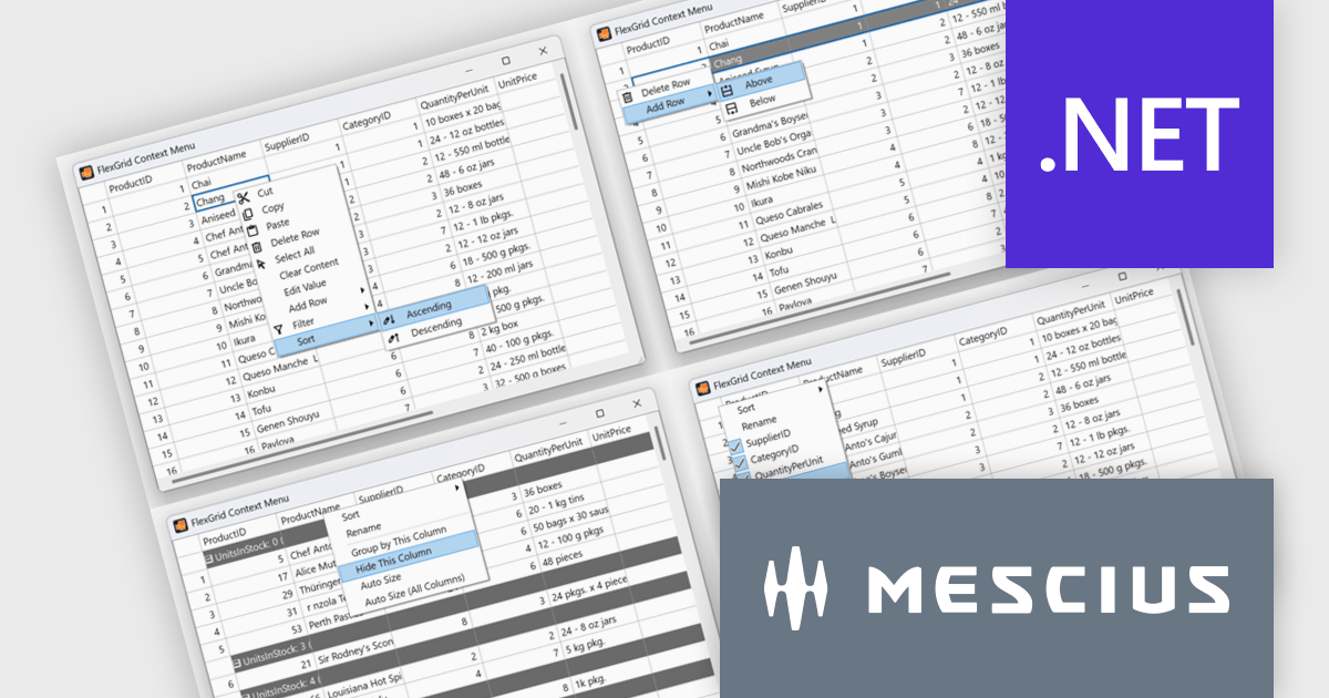
ComponentOne Studio Enterprise is a comprehensive suite of .NET UI controls developed by MESCIUS (formerly GrapeCity) designed for building rich, interactive desktop, web, and mobile applications. It provides developers with a broad range of tools and components-including data grids, charts, reports, input controls, and advanced data visualization features-for platforms such as WinForms, WPF, ASP.NET Core, Blazor, WinUI, and .NET MAUI. The suite emphasizes performance, flexibility, and ease of integration, helping teams create consistent, feature-rich user experiences across multiple application types while maintaining a unified development approach.
The ComponentOne 2025 v1.2 update includes a new sample demonstrating a complete, custom context menu solution for FlexGrid. It allows developers to define context-aware actions that adapt to different parts of the grid. This enables right-click functionality to insert rows, sort or group columns, and open a column picker directly within the grid. Developers benefit from the flexibility of FlexGrid’s API to implement tailored solutions while providing end users with a familiar, Excel-like experience that enhances efficiency and precision in data management tasks.
To see a full list of what's new in 2025 v1.2, see our release notes.
ComponentOne Studio Enterprise is licensed per developer on a perpetual basis and includes a 12 month subscription. Priority Support is also available. See our ComponentOne Studio Enterprise licensing page for full details.
Learn more on our ComponentOne Studio Enterprise product page.
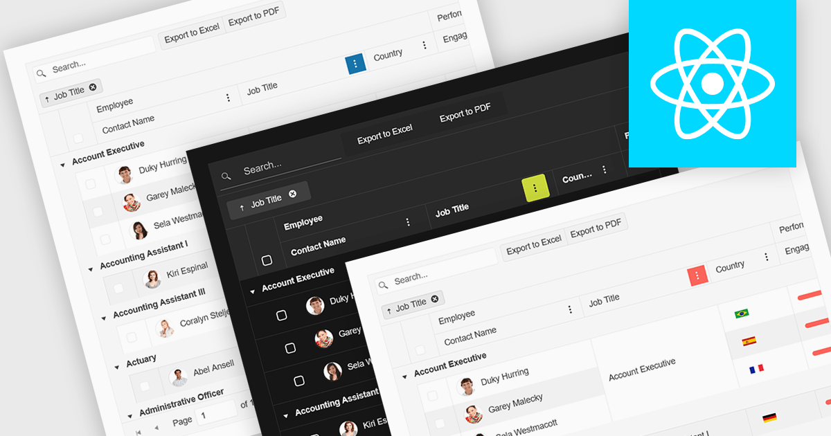
Built-in theme support in a React grid refers to the component's ability to natively integrate and adapt to predefined visual styles without requiring extensive custom CSS. This feature allows developers to quickly apply consistent, professional-looking designs that align with widely used UI frameworks such as Material UI, Bootstrap, or custom enterprise branding. It simplifies the process of maintaining visual consistency across applications, reduces front-end development time, and ensures that the grid remains visually coherent with the rest of the user interface, particularly during updates or when switching between themes.
Several React Grid controls offer support for built-in themes including:
For an in-depth analysis of features and price, visit our comparison of React Grid controls.
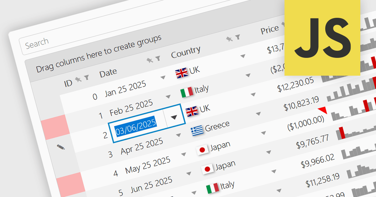
A date/time cell type in a JavaScript Grid control lets developers manage temporal data more effectively by treating input as actual JavaScript Date objects rather than plain text. This enables built-in features like calendar popups, time pickers, and structured output formats such as "09/09/2025" or "Sep 9 2025", making it easier for users to interact with the data accurately. It's especially useful in applications that rely on scheduling, activity logs, or time-driven reports. Most modern grid libraries also support localization, formatting, and input validation to ensure the cell behavior fits seamlessly with the application's design and data standards.
Several JavaScript Grid controls offer support for Date/Time cell types including:
For an in-depth analysis of features and price, visit our comparison of JavaScript Grid controls.
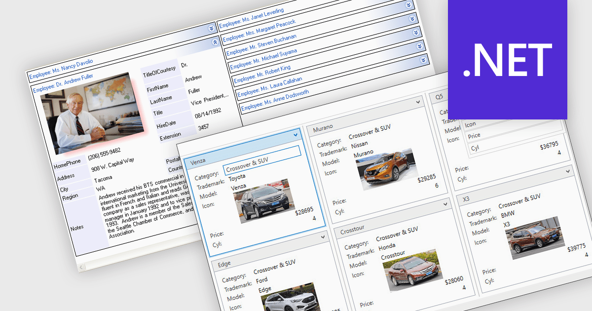
Card view is a grid layout option that displays data as a series of individual cards arranged in rows and columns, rather than as traditional table rows. Each card encapsulates related fields, often with custom formatting and embedded controls, allowing for more visual and flexible presentation of complex data. This format is especially beneficial in scenarios where users need to review, interact with, or compare structured records involving rich content or media in a more engaging and user-friendly layout.
Several .NET grid components allow you to use card view, including:
For an in-depth analysis of features and price, visit our comparison of .NET grid components.
電話: (888) 850 9911
Fax: +1 770 250 6199


