


公式サプライヤー
公式および認定ディストリビューターとして200社以上の開発元から正規ライセンスを直接ご提供いたします。
当社のすべてのブランドをご覧ください。
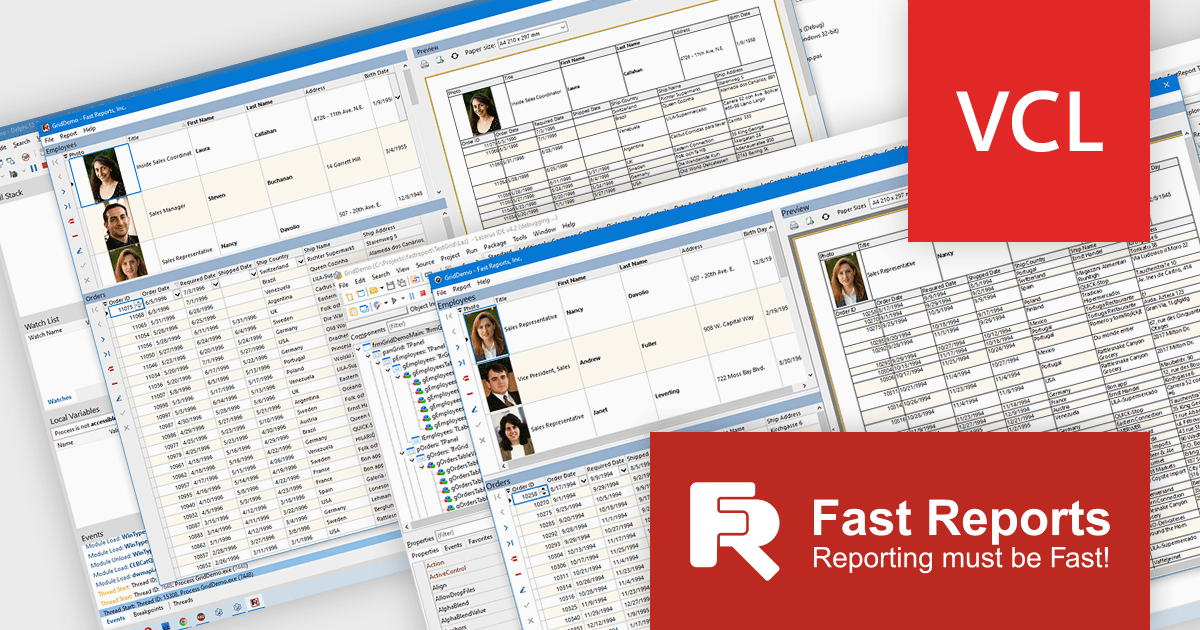
FastGrid is a modern, high-performance grid component designed for VCL and Lazarus environments, now incorporated into the FastReport VCL Ultimate package. It provides developers with an efficient and intuitive way to present, explore, and interact with data using minimal code. By supporting the standard TDataSource interface, FastGrid works easily with a wide range of database access technologies, including FireDAC, ADO, BDE, IBX, Oracle, and more, making it a versatile solution for data-driven applications. Its full compatibility with FastReport VCL also allows users to print and export while retaining all sorting, filtering, and visual settings.
The new FastGrid component introduces a robust set of features that benefit developers working with data grids. It offers built-in filtering and sorting that eliminate the need for custom UI logic, as well as smart editors that automatically adapt to the underlying data type, such as text, numeric values, lists, checkboxes, or even images, to enhance usability and accuracy. FastGrid delivers full WYSIWYG configuration at design time, allowing precise control of columns and interface elements. It is fully integrated with FastReport VCL, enabling printing and exporting to all supported formats while preserving display settings and user-applied filters. With full source code included, developers also gain the flexibility to customize and extend the component to meet specific project requirements.
FastGrid is included in FastReport VCL Ultimate which is licensed per named user and is available as a Perpetual license with 1 year of technical support and product updates. See our FastReport VCL Ultimate licensing page for full details.
Learn more on our FastReport VCL Ultimate product page.
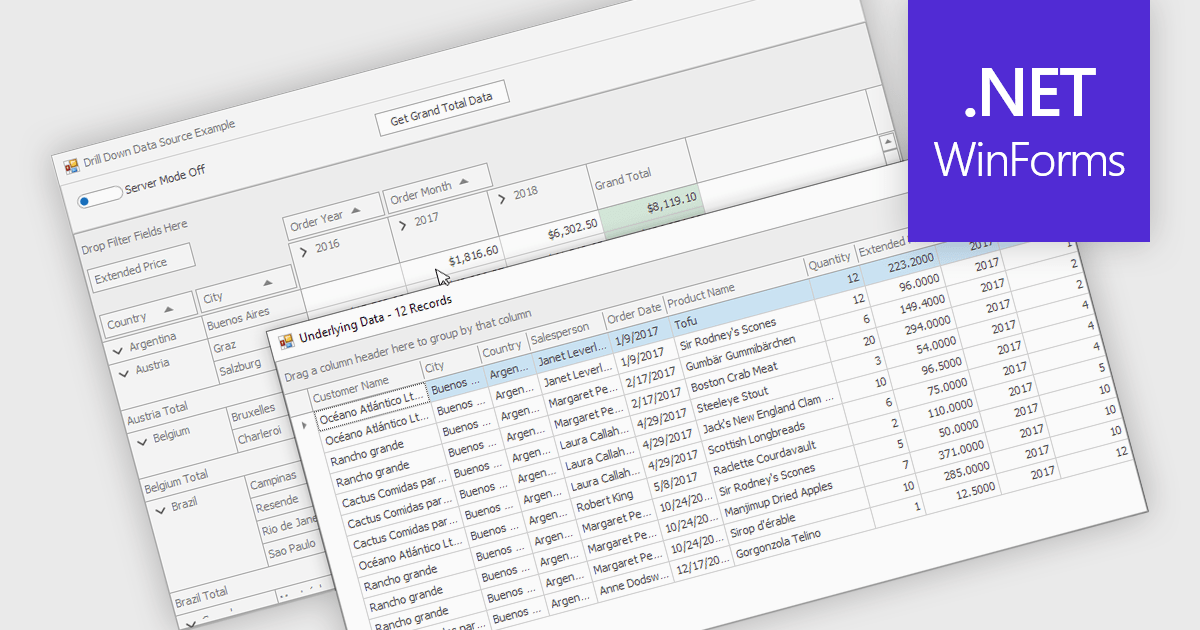
Drill-down capability within a grid control enables users to move from summary data to increasingly detailed records within the same interface, creating a smooth and focused exploration experience. It improves productivity by reducing screen changes and extra queries, helps users spot patterns and exceptions more quickly, and keeps complex information clearly organized. Typical use cases include reviewing sales by region, then by city and customer, analyzing financial summaries that open into individual transactions, or exploring product inventories from category to specific item.
Several .NET WinForms grid controls offer drill-down capability including:
For an in-depth analysis of features and price, visit our .NET WinForms grid controls comparison.
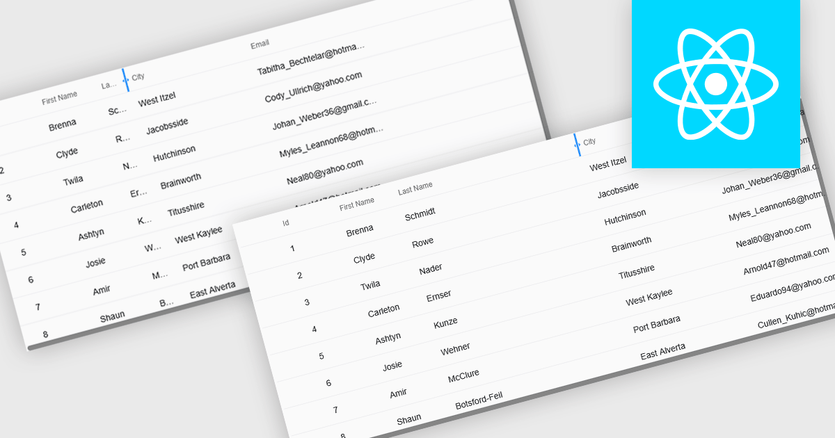
Resizable grid columns let users adjust the width of each column in a data table, giving them direct control over how information is displayed. This improves readability by preventing text from being cut off, reduces clutter by narrowing less important fields, and creates a cleaner, more efficient workspace. It is especially useful with large datasets, long product names, detailed descriptions, or mixed data types, such as expanding a “Description” column to read full text or narrowing numeric columns to compare figures quickly. Whether used in dashboards, admin panels, reporting tools, or data entry systems, column resizing enhances usability, speeds up analysis, and supports a more personalized viewing experience.
Several React grid controls offer support for expanding and resizing columns including:
For an in-depth analysis of features and price, visit our React grid controls comparison.

The NEW Highcharts Grid Pro provides IT professionals with a powerful JavaScript component to build interactive and customizable data grids which enable efficient data editing, filtering, and management within complex datasets, enhancing the usability of data-intensive applications across various technical fields.
On Wednesday, November 19th at 1:00 PM EST, Highcharts Chief Product Officer Øystein Moseng & Product Manager Stian Totland will be presenting a LIVE tutorial-stye and interactive walkthrough of Grid Pro, demonstrating how to edit and validate data seamlessly with Grid Pro's intuitive tools.
As part of the official launch of Highcharts Grid Pro, this webinar will guide you through the many powerful feature of Grid Pro, including:
Register for the LIVE Webinar today and mark your calendar for November 19th!
Infragistics Ultimate is a comprehensive development toolkit designed to streamline the creation of high-performance, visually rich applications across multiple platforms. It includes a wide range of user interface (UI) components and development tools for web, desktop, and mobile applications, supporting frameworks such as Angular, React, Blazor, .NET, and more.
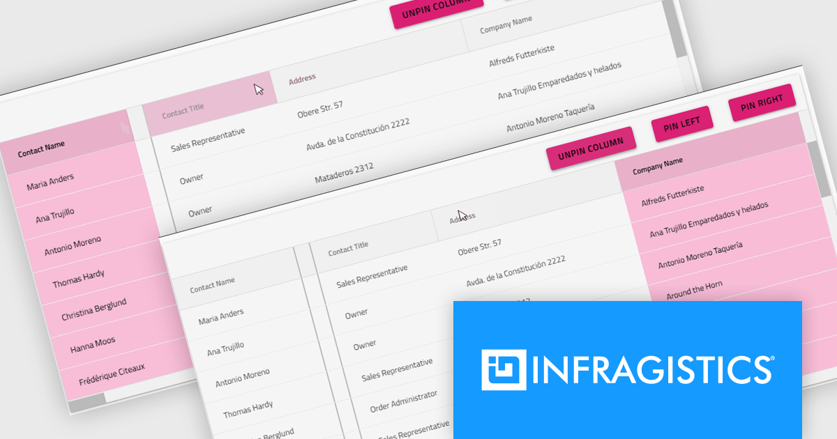
The Infragistics Ultimate 25.2 release includes a feature that lets developers specify individual pinning locations for each grid column, making it possible to fix important data on both the left and right edges of a grid. This added flexibility helps create cleaner, more efficient layouts that keep key information visible at all times. Whether you’re working in Angular, React, Web Components, or Blazor, this capability improves data presentation, simplifies large dataset navigation, and enhances the overall usability of modern web applications.
To see a full list of what's new in version 25.2, see our release notes.
Infragistics Ultimate is licensed per developer and is available as a Perpetual License with a 1, 2 or 3 year support and maintenance subscription. See our Infragistics Ultimate licensing page for full details.
For more information, visit our Infragistics Ultimate product page.
電話: (888) 850 9911
Fax: +1 770 250 6199


