


公式サプライヤー
公式および認定ディストリビューターとして200社以上の開発元から正規ライセンスを直接ご提供いたします。
当社のすべてのブランドをご覧ください。
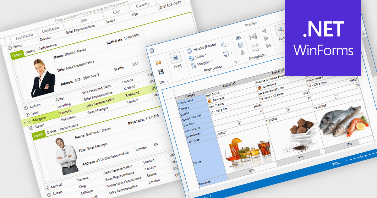
Displaying an image within a grid cell allows developers to combine visual and textual data, making information more intuitive and engaging. This feature enables images such as icons, product photos, or user avatars to appear directly alongside related values, providing immediate visual context and helping users quickly interpret complex datasets. The result is a more dynamic and user-friendly interface that enhances clarity, recognition, and overall usability. Common use cases include showing product images in inventory lists, employee photos in directories, or country flags in international sales reports, allowing users to connect visuals with data for faster understanding and improved decision-making.
Many .NET WinForms grid controls support displaying images within cells, including:
For an in-depth analysis of features and price, visit our comparison of .NET WinForms Grid Controls.
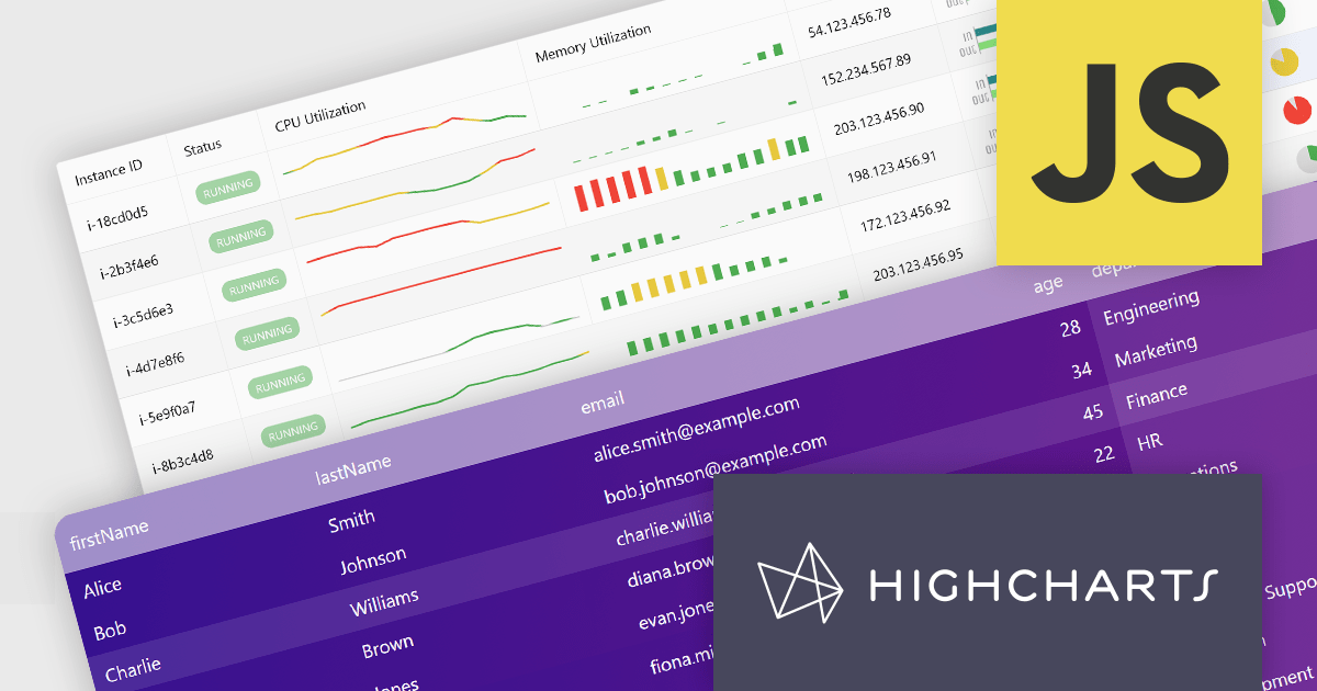
Highcharts Grid Pro is a versatile data grid component developed by the creators of Highcharts, offering both standalone functionality and tight integration within the Highcharts and Highcharts Dashboards ecosystems. It features advanced capabilities such as real-time data binding, column sorting, filtering, inline editing, pagination, and data export, enabling users to work with structured data efficiently. Designed to complement Highcharts' visual components, Grid Pro allows for seamless alignment between data tables and interactive charts when used together, but it can also function independently in applications that require only tabular data interaction. This makes it ideal for a wide range of use cases, including financial platforms, business intelligence tools, and any application where users need to view, edit, and interact with complex datasets directly in the browser.
Highcharts Grid Pro is now available as a standalone component. The v2.0 update delivers a set of professional-grade enhancements focused on improving usability, data control, and visual clarity. It introduces interactive editing with built-in editors for text, numbers, and dates, making in-grid updates more intuitive. Configurable validation rules ensure data accuracy, while embedded sparklines, powered by Highcharts Core, provide immediate visual insights alongside the data. Features such as pagination, column filtering, and sorting make it easier to manage and explore large datasets. Developers can also implement custom behaviors and event hooks to align the grid with specific application needs.
For a limited time you can benefit from special introductory pricing!
Save 50% off new licenses of Highcharts Grid Pro or Highcharts Dashboards when bought individually or when combined in a bundle with other products from Highsoft including Highcharts Core, Stock, Maps and Gantt.
Highcharts Grid Pro is licensed per developer as an Annual or Perpetual License with Internal, Saas, SaaS+ and OEM distribution options. The annual license includes support and all product updates for 1 year and must be renewed to continue to use the software. The perpetual license includes an "Advantage Subscription" which provides support and updates for a set period of time. If you do not renew Advantage then you may continue to use the software at the last release available during the active Advantage period. See our Highcharts Grid Pro licensing page for full details.
Learn more on our Highcharts Grid Pro product page.
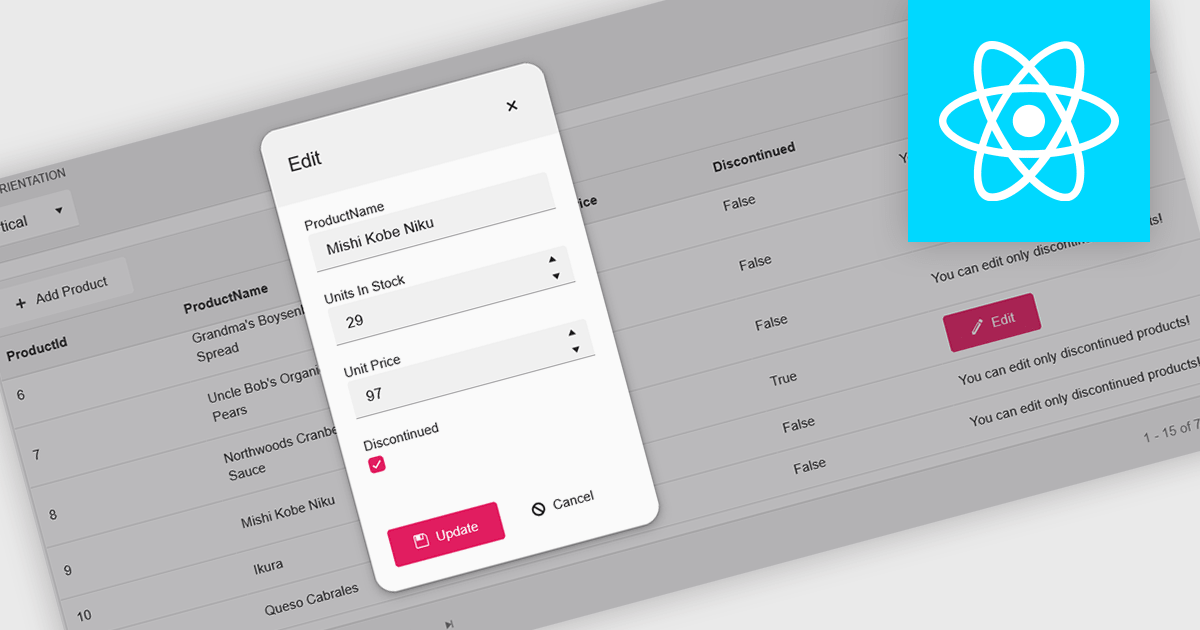
A pop-up editor in a grid provides an efficient and user-friendly way to edit data directly within a grid interface without navigating to a separate page. When a record is selected for editing, a pop-up window appears above the grid, presenting all relevant fields in a clean, structured form. This approach streamlines data management by allowing focused edits while preserving the context of the main dataset. It is particularly beneficial for complex records that contain multiple fields, nested information, or require detailed validation. Common use cases include editing customer records in CRM systems, updating inventory details in product management dashboards, or modifying entries in administrative data grids. By combining convenience, clarity, and control, a pop-up editor enhances both productivity and the overall user experience.
Many React grid controls offer popup editors including:
For an in-depth analysis of features and price, visit our comparison of React Grid Controls.
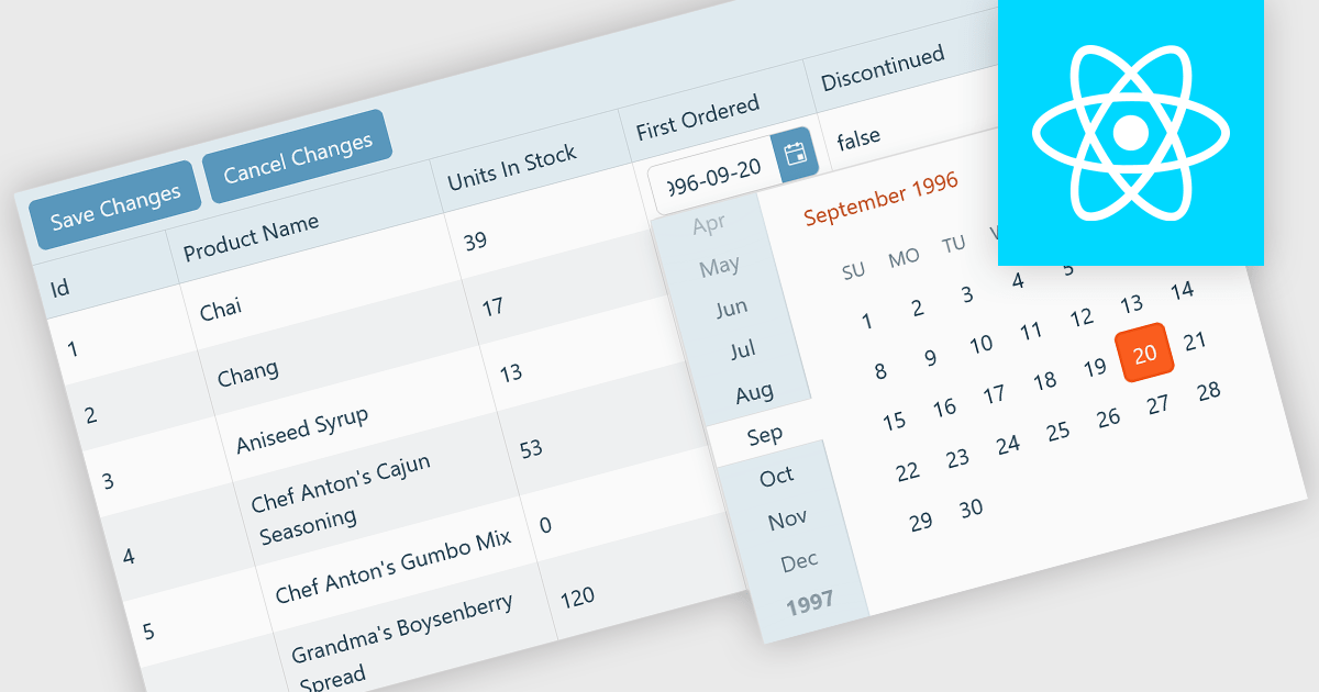
A custom grid editor allows developers to tailor how users interact with data directly within grid cells, providing a flexible and efficient editing experience. Instead of relying on standard text inputs, custom editors can include dropdowns, sliders, toggles, or calendar components to match the data type. This approach not only improves data entry and validation but also enhances accuracy and user satisfaction by ensuring inputs are contextually relevant. For example, a date field might use an inline date picker, while a status column could feature a dropdown with predefined options. Ideal for data-heavy applications such as dashboards, scheduling tools, and administrative panels, custom grid editors help users to edit complex data quickly and intuitively without leaving the main interface.
Several React Grid controls offer support for custom editing including:
For an in-depth analysis of features and price, visit our comparison of React Grid controls.
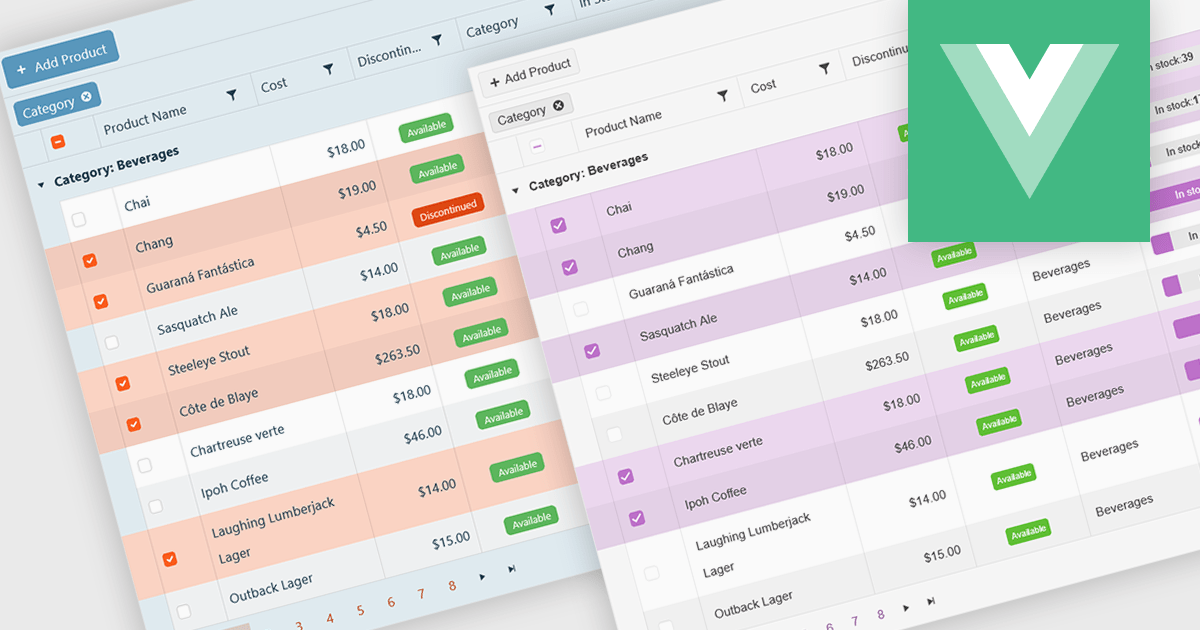
A checkbox cell type in a grid allows users to easily manage Boolean (true or false) data through a simple and visual interface. Instead of typing values manually, users can quickly toggle a checkbox to indicate states such as active or inactive, complete or incomplete, or enabled or disabled. This interaction reduces input errors and enhances data clarity, making it easy to scan and understand information at a glance. Checkbox cells improve productivity by supporting quick edits, bulk selections, and efficient filtering based on checked or unchecked values. Common use cases include task tracking, user permissions, product availability, and feature toggles where a binary choice improves workflow efficiency and usability.
Several Vue.js grid components offers checkbox cell type support, including:
For an in-depth analysis of features and price, visit our comparison of Vue.js grid components.
電話: (888) 850 9911
Fax: +1 770 250 6199


