


公式サプライヤー
公式および認定ディストリビューターとして200社以上の開発元から正規ライセンスを直接ご提供いたします。
当社のすべてのブランドをご覧ください。

インフラジスティックス・ジャパン株式会社は、Web アプリケーション向け有償 UI ライブラリ「Ignite UI」の一部をオープンソース版として無償提供開始しました。これにより、Grid Lite、Button、Calendar、Stepper など 50 種類以上の UI コンポーネントが商用・非商用問わず利用可能になります。Angular、Blazor、React、Web Components といった主要フレームワークに対応し、UI 部品を一から自作せずに高品質な UI を素早く構築できる環境が整いました。無償版は OSS コミュニティベースのサポートで、日本語テクニカルサポートは付帯しませんが、Discord や GitHub での協力が可能です。一方、より高度なグリッド機能やエンタープライズ向けコンポーネントは引き続き有償のプレミアム版で提供されます。小規模開発やプロトタイプにも適したこのオープンソース化は、Web 開発現場の負担軽減に寄与する重要な一歩です
一方、有料版では、大規模データ対応の高機能グリッド、豊富なチャート、高度なフィルタリングやエクスポート機能など、エンタープライズ開発に不可欠な機能が利用可能です。さらに、公式の技術サポート、定期的なアップデート、長期的な製品保守により、業務システムでも安心して導入できます。なお、OSSと有料版を使い分けることで、開発規模に応じた最適なUI戦略が可能になります。
Ignite UI有料版の製品情報及び購入情報は以下のリンクをご参考ください。
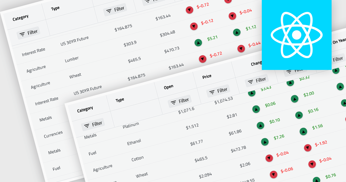
Virtual scroll support in a grid component is a rendering strategy that displays only the rows and columns currently visible in the viewport while dynamically loading and unloading data as the user scrolls. It minimizes DOM size and memory usage by avoiding the creation of off-screen elements, which improves rendering speed, reduces layout thrashing, and maintains smooth interaction even with very large datasets. This approach enables grids to handle millions of records efficiently without requiring pagination, lowers CPU and GPU load, and delivers consistent performance across a wide range of devices.
Several React grid controls offer virtual scroll capability including:
For an in-depth analysis of features and price, visit our React grid controls comparison.
Infragistics Ignite UI for Angular is a comprehensive suite of Angular components and UI controls designed to accelerate development of high-performance, enterprise-grade web applications. It offers a rich collection of data grids, charts, and other UI elements, along with advanced features like pivoting, docking, and hierarchical data management. Built on Angular, the toolkit integrates into existing projects and provides a foundation for building modern, responsive, and interactive user interfaces.
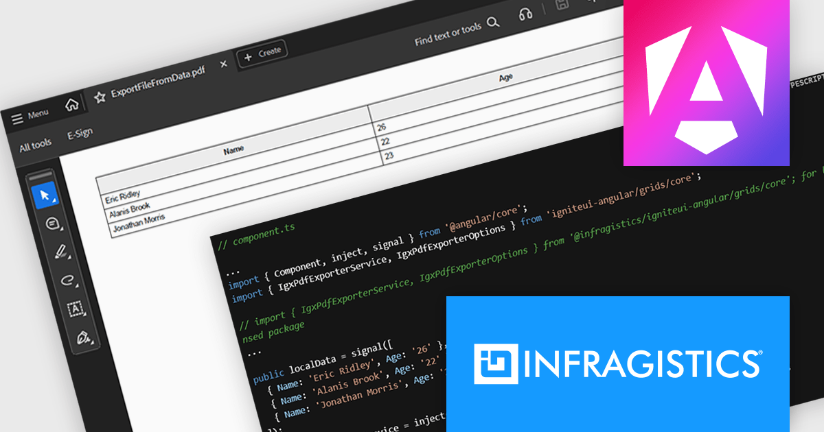
The Ignite UI for Angular 21 release introduces the Grid PDF Exporter, a new service that allows developers to export data directly into PDF format from both raw arrays and advanced Angular grid components like IgxGrid, IgxTreeGrid, IgxHierarchicalGrid, and IgxPivotGrid. It offers a rich set of export capabilities including support for multi-page documents, automatic handling of page breaks, and customization of PDF formatting. Whether you're working with hierarchical data or flat tables, the service provides a structured and flexible solution for generating professional PDF files.
To see a full list of what's new in version 21, see our release notes.
Infragistics Ignite UI for Angular is part of Infragistics Ignite UI which is licensed per developer and is available as a Perpetual License with a 1, 2 or 3 year support and maintenance subscription. See our Infragistics Ignite UI licensing page for full details.
Infragistics Ignite UI for Angular is available in the following products:
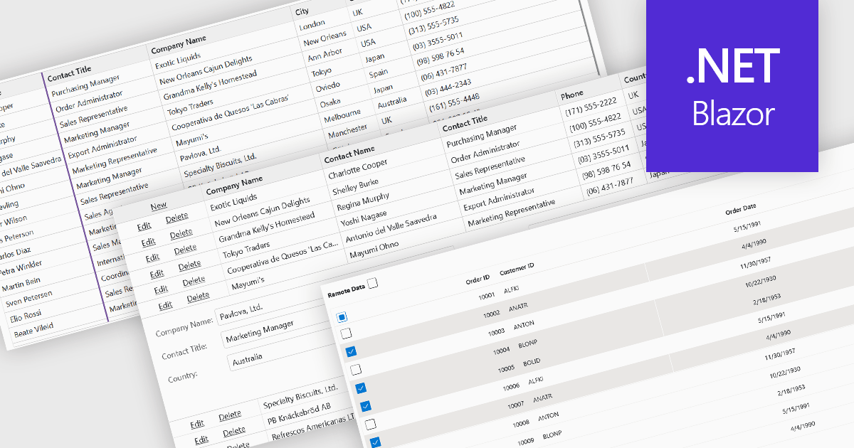
Row and column features form the core of modern grid components, enabling users to view, navigate, and manipulate tabular data efficiently. These capabilities improve usability and help developers present information in a structured, interactive format suited to many types of applications. By offering clear ways to organise, edit, and inspect information, row and column features allow users to work more effectively while maintaining control over how content is displayed.
Common features include:
For an in-depth analysis of features and price, visit our Blazor grid components comparison.
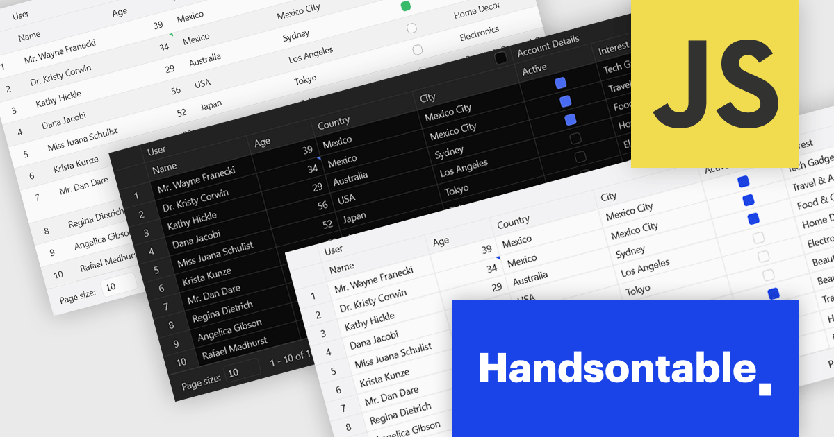
Handsontable is a JavaScript library designed to help developers build interactive data grids into their web applications. Offering a familiar spreadsheet-like interface, it allows users to edit, sort, and filter data with ease. Highly customizable and compatible with popular frameworks like React and Angular, Handsontable empowers developers to build robust data manipulation features into their web applications.
The Handsontable 16.2.0 update introduces a redesigned approach to CSS theming with the addition of an alias-based variable system. This new hierarchy organizes CSS variables into logical layers, separating core values from theme-specific settings. As a result, developers can now apply consistent visual customization across the grid while maintaining clean, manageable stylesheets. This change significantly reduces the guesswork involved in identifying the correct variables and improves maintainability by clearly documenting the relationships between base tokens and theme aliases. It's a notable enhancement for teams looking to build and manage complex, branded UI components with greater efficiency and clarity.
To see a full list of what's new in version 16.2.0, see our release notes.
Handsontable is licensed per developer and is available as an Annual or Perpetual license with 1 year support and maintenance. See our Handsontable licensing page for full details.
For more information, visit our Handsontable product page.
電話: (888) 850 9911
Fax: +1 770 250 6199


