


公式サプライヤー
公式および認定ディストリビューターとして200社以上の開発元から正規ライセンスを直接ご提供いたします。
当社のすべてのブランドをご覧ください。
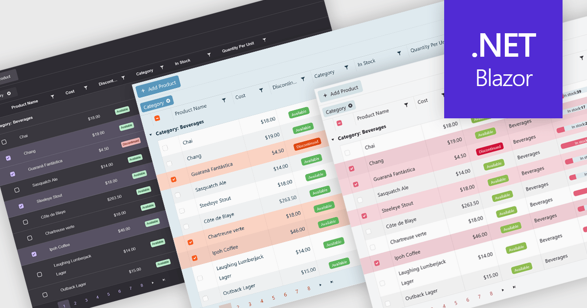
Built-in themes for grids are pre-designed visual styles that can be applied directly to data grid components within applications. These themes define elements such as color schemes, typography, spacing, and borders to create a consistent and polished appearance without requiring manual CSS. The primary benefit is efficiency, as teams can quickly implement a cohesive look that aligns with modern user interface standards. Built-in themes also enhance usability by improving readability, supporting accessibility, and offering a familiar interface that reduces user effort. For example, enterprise dashboards, admin panels, and financial reporting tools can all benefit from built-in themes to present complex data in a clear, user-friendly format while maintaining visual consistency across different parts of the application.
Several .NET Blazor grid components offer built-in theme support including:
For an in-depth analysis of features and price, visit our .NET Blazor grid controls comparison.
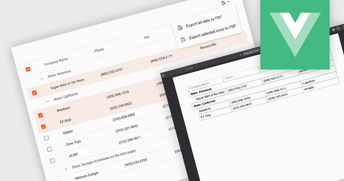
Export selection in a data grid is the ability to export only a defined range, the specific rows, columns or cells that a user has actively selected, rather than the entire dataset. This selective approach is particularly valuable when working with large data sets, as it allows users to extract and share only the most relevant subset of information without additional filtering or manual deletion after export. By reducing the volume of unnecessary data in exported files, it improves efficiency, helps maintain focus on the intended content, and can enhance security by avoiding the inclusion of sensitive or unrelated information. This targeted export capability is commonly used to output data in formats such as CSV, Excel, or PDF, supporting the integration of grid data into reporting and analysis processes.
Several Vue.js grid components allow you to export selections, including:
For an in-depth analysis of features and price, visit our comparison of Vue.js grid components.
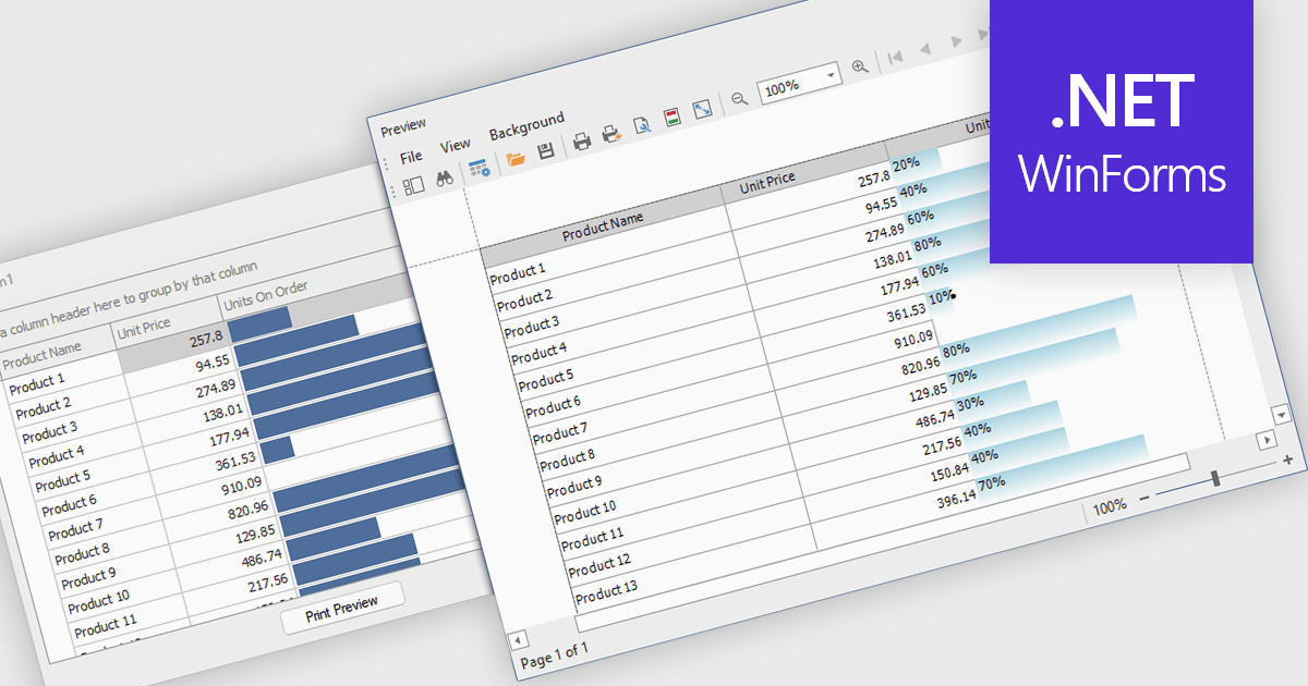
ProgressBar cell types in a .NET WinForms grid control are specialized cells that visually represent progress or completion levels within a grid layout, using horizontal progress bars. These cells are particularly useful for tracking status indicators, such as task completion or data processing percentages, directly within tabular views. They provide a clear, immediate representation of numeric progress values, enhancing readability without requiring users to interpret raw numbers. For developers, integrating ProgressBar cells simplifies the task of conveying progress-related information in data-driven interfaces, offering a familiar and consistent user experience aligned with standard Windows Forms controls.
Several .NET WinForms grid controls offer ProgressBar cell type controls, including:
For an in-depth analysis of features and price, visit our .NET WinForms grid controls comparison.
ComponentOne Studio WinForms by MESCIUS is a comprehensive toolkit offering over 120 advanced UI components to streamline Windows Forms application development. It empowers you to build visually appealing and feature-rich applications with functionalities like data visualization through charts and reports, intuitive data editing with performant grids, and modern UI elements including ribbons and docking for a user-friendly experience.
The ComponentOne Studio WinForms 2025 v1 maintenance update refines the FlexGrid Filter UI by making the dropdown more compact, allowing it to fit more efficiently within tight interface layouts. This adjustment improves the overall usability of the grid, particularly in data-heavy applications where screen space is limited. By streamlining the visual footprint of the filter interface, developers can deliver cleaner, more focused user experiences without compromising functionality, making it easier for end users to interact with and analyze data effectively.
To see a full list of what's new in 2025 v1 maintenance release, see our release notes.
ComponentOne Studio WinForms is licensed per developer on a perpetual basis and includes a 12 month subscription. Priority Support is also available. See our ComponentOne Studio WinForms licensing page for full details.
Learn more on our ComponentOne Studio WinForms product page.
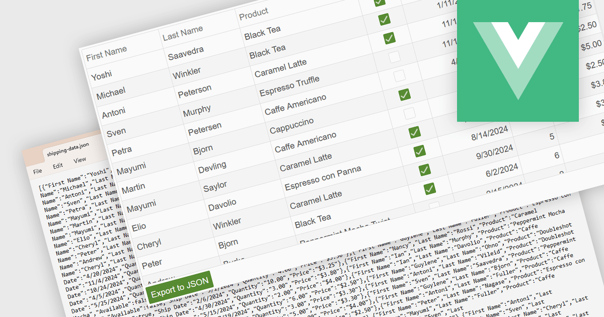
Exporting a data grid to JSON format is a common feature in modern web-based data tools that involves converting the structured data displayed in a grid, such as rows and columns representing records and fields, into JavaScript Object Notation (JSON), a lightweight, text-based format commonly used for data interchange. This process enables the grid's contents to be saved in a machine-readable structure that preserves the hierarchy and attributes of the data, making it easily consumable by web services, APIs, or other applications. The benefits of exporting to JSON include its compatibility with a wide range of programming environments, ease of integration with frontend and backend systems, and suitability for transmitting data across networked systems or persisting it for later use in client-side operations or remote storage.
Several Vue.js grid controls allow you to export to JSON, including:
For an in-depth analysis of features and price, visit our comparison of Vue.js grid controls.
電話: (888) 850 9911
Fax: +1 770 250 6199


