


公式サプライヤー
公式および認定ディストリビューターとして200社以上の開発元から正規ライセンスを直接ご提供いたします。
当社のすべてのブランドをご覧ください。
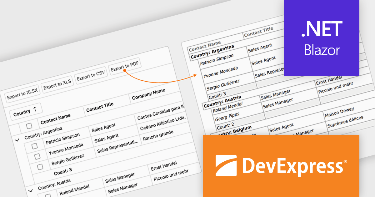
DevExpress Blazor (part of DevExpress ASP.NET and Blazor) helps you create high-impact user experiences for both Blazor Server and Blazor WebAssembly using C#. The Blazor UI Component Library ships with a comprehensive set of native components (including a DataGrid, Pivot Grid, Scheduler, Chart, Data Editors and Reporting).
The DevExpress Blazor v25.1 update enhances the Blazor Grid component with support for PDF export, allowing developers to generate documents that mirror the current data view. This includes all applied filters, sort orders, and group configurations, ensuring that the exported content matches the user's on-screen context. The PDF output retains data columns, group rows with summaries, and overall total summaries, making it a practical tool for sharing, archiving, or printing user-customized reports. This update helps developers deliver consistent, visually structured documents from within Blazor applications.
To see a full list of what's new in version 25.1, see our release notes.
DevExpress ASP.NET and Blazor is licensed per developer and is available as a Perpetual License with a 12 month support and maintenance subscription. See our DevExpress ASP.NET and Blazor licensing page for full details.
DevExpress Blazor is available in the following products:
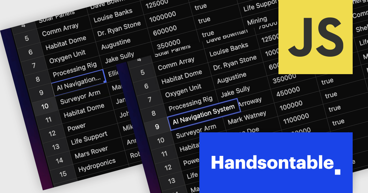
Handsontable is a JavaScript library designed to help developers build interactive data grids into their web applications. Offering a familiar spreadsheet-like interface, it allows users to edit, sort, and filter data with ease. Highly customizable and compatible with popular frameworks like React and Angular, Handsontable empowers developers to build robust data manipulation features into their web applications.
The Handsontable 16.0.0 update adds a new feature called 'textEllipsis' which improves the readability and layout of tables. When activated, this feature automatically replaces any overflowing text in a cell with an ellipsis (…), ensuring that excessive content does not spill over and disrupt the alignment of the table. This approach keeps tables visually clean while clearly signaling that additional content exists, making it easier for users to scan data-heavy views without distraction.
To see a full list of what's new in version 16.0.0, see our release notes.
Handsontable is licensed per developer and is available as an Annual or Perpetual license with 1 year support and maintenance. See our Handsontable licensing page for full details.
For more information, visit our Handsontable product page.
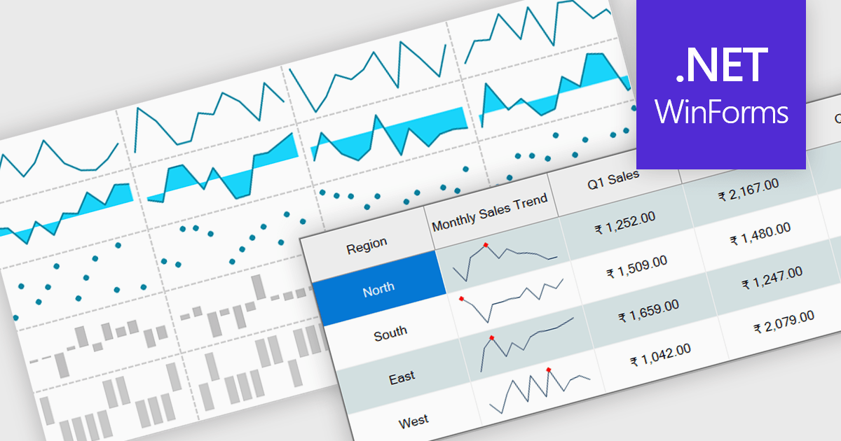
Sparklines are small embedded charts displayed within individual cells of a data grid or table, offering a compact and intuitive way to visualize trends, patterns and variations in data. Unlike traditional charts, sparklines are designed to fit alongside text or numerical values, providing immediate visual context without taking up additional space. This makes them ideal for high density dashboards and reports where space efficiency and quick interpretation are important. By enabling users to scan and compare trends across multiple rows at a glance, sparklines support faster decision making and improved data comprehension. Common use cases include tracking stock performance over time, visualizing monthly sales trends, monitoring temperature fluctuations or comparing website traffic across multiple pages directly within the grid.
Several .NET Winforms grid controls offer support for sparklines including:
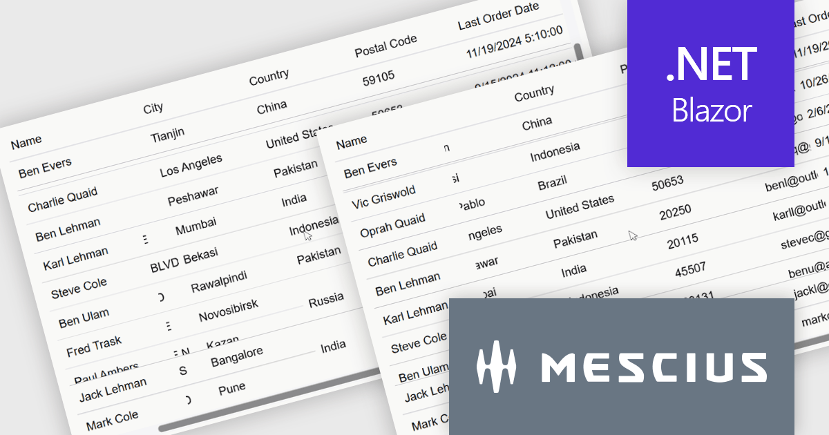
ComponentOne Studio Blazor Edition by MESCIUS allows developers to leverage their existing C# skills to build rich web applications. This comprehensive suite includes high-performance, native Blazor UI controls like FlexGrid, a powerful datagrid with data virtualization, and 50+ chart types for data visualization. It also offers essential input controls like Autocomplete and Combobox, improving development efficiency and creating a seamless experience for both developers and users.
The ComponentOne Studio Blazor Edition 2025 v1 update introduces support for freezing columns to the right and rows to the bottom in FlexGrid, giving developers greater control over data presentation in complex UI scenarios. This enhancement allows critical data such as totals or summary rows and columns to remain visible as users scroll through the grid, improving usability and reducing the need for redundant navigation. It aligns with common spreadsheet behavior and enables developers to deliver a more intuitive and efficient user experience within their Blazor applications.
To see a full list of what's new in 2025 v1, see our release notes.
ComponentOne Studio Blazor Edition is licensed per developer on a perpetual basis and includes a 12 month subscription. See our ComponentOne Studio Blazor Edition licensing page for full details.
ComponentOne Studio Blazor Edition is available individually or as part of ComponentOne Studio Enterprise.
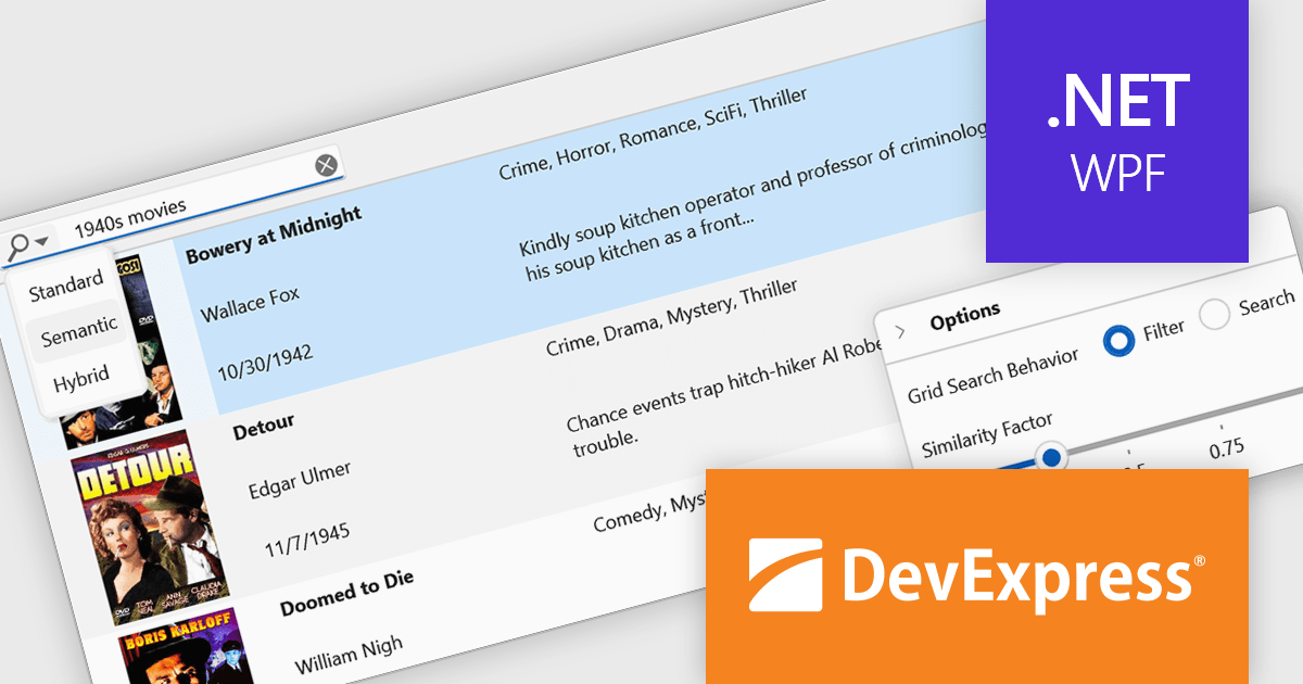
DevExpress WPF is a powerful suite of controls that enhances your WPF development toolkit. It offers data grids, ribbon menus, rich text editors, spreadsheets, charts, and more – all with beautiful themes and touch-friendly interfaces. DevExpress WPF empowers you to build professional-looking, responsive applications that meet modern user expectations, saving you time and effort while adding polish and functionality.
The DevExpress WPF v25.1 update introduces a new semantic search capability for the Data Grid that leverages Natural Language Processing (NLP). Rather than depending solely on exact keyword matches, it converts user input into vector representations. These representations are then analyzed through a similarity algorithm, allowing the system to identify and rank results based on contextual meaning. This update significantly improves the quality of search results, especially in datasets where users may phrase queries in varied or imprecise ways. It’s particularly beneficial in applications that deal with complex or user-generated content, offering developers a more natural and adaptive search mechanism.
To see a full list of what's new in version 25.1, see our release notes.
DevExpress WPF is licensed per developer and is available as a Perpetual License with a 12 month support and maintenance subscription. We can supply new subscriptions, subscription renewals, and additional licenses. See our DevExpress WPF licensing page for full details.
DevExpress WPF is available to buy in the following products:
電話: (888) 850 9911
Fax: +1 770 250 6199


