


公式サプライヤー
公式および認定ディストリビューターとして200社以上の開発元から正規ライセンスを直接ご提供いたします。
当社のすべてのブランドをご覧ください。
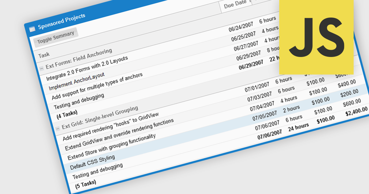
The grouping/summary feature in grid controls enables users to categorize and analyze data effectively by grouping rows based on specific criteria. This functionality allows for the aggregation of data within each group, providing valuable summaries such as totals, averages, counts, and more. By organizing information in a more structured manner, users can gain deeper insights into trends, patterns, and outliers within their data. This feature is particularly useful for large datasets, financial reporting, and data analysis tasks that require a high level of customization and flexibility.
Several JavaScript Grid controls offer grouping / summary support including:
For an in-depth analysis of features and price, visit our comparison of JavaScript grid controls.
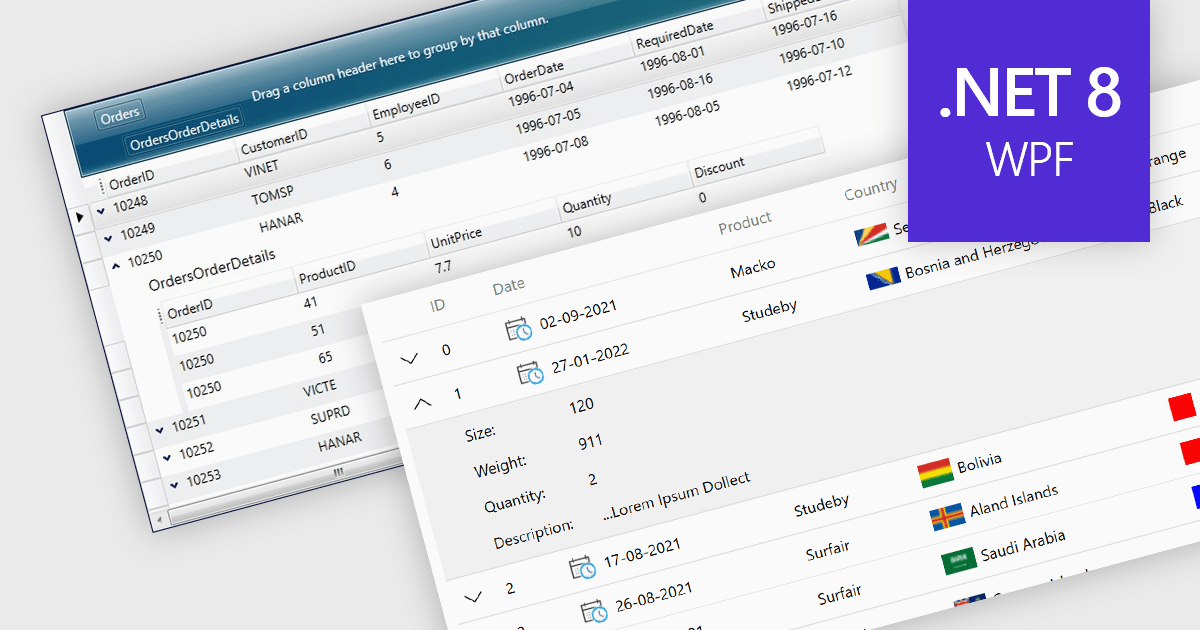
Master-detail is a user interface design technique where a primary data set (the master) is displayed in a grid format, and related information (the detail) is typically shown in an adjacent pane when a master item is selected. The resulting hierarchical structure allows users to efficiently navigate and explore complex data sets by viewing high-level information in the master grid while accessing more granular details on demand, without navigating away from the main page. The master-detail view enhances the user experience as it improves the organization of the grid and streamlines workflows as users can quickly switch between records and details.
Several .NET 8 WPF grid components offer support for master-detail, including:
For an in-depth analysis of features and price, visit our comparison of .NET 8 WPF grid components.
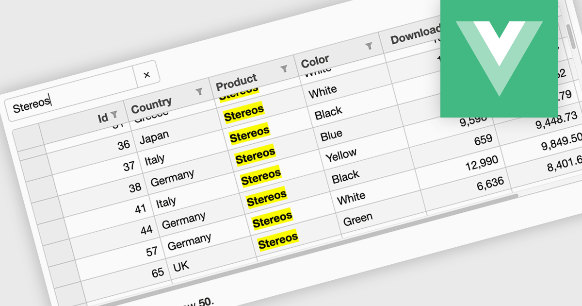
Searching in a grid component refers to the ability for users to quickly locate specific data within a table or grid-like structure. It involves filtering the displayed data based on user-defined criteria, such as text strings or numerical values. This functionality significantly enhances user experience by allowing users to efficiently find relevant information without having to manually scan through large datasets. By implementing search functionality, developers can improve the usability and overall effectiveness of their grid applications.
Several Vue.js grid controls offer searching functionality including:
For an in-depth analysis of features and price, visit our comparison of Vue.js grid controls.
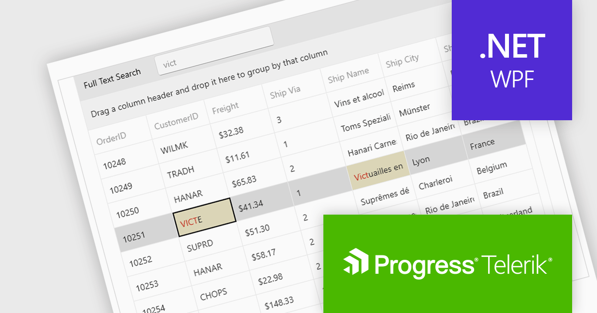
Telerik UI for WPF is an extensive UI library specifically designed for building modern and feature-rich business applications using the Windows Presentation Foundation (WPF) framework. It offers many customizable controls, ranging from data-driven grids and charts to specialized navigation and input components. The suite emphasizes performance and user experience, providing data virtualization for handling large datasets efficiently and ensuring visually appealing interactions.
The Telerik UI for WPF 2024 Q3 (2024.3.806) update enhances the DataGrid control by implementing "Search as You Type" behavior without filtering the items. This new option provides users with greater control over the grid search process with the ability to disable data filtering when performing search operations. By enabling users to tailor the filtering behavior, this feature ensures that search results are not inadvertently limited by active filters, potentially revealing more relevant data that would otherwise be hidden.
To see a full list of what's new in 2024 Q3, see our release notes.
Telerik UI for WPF is licensed per developer and is available as a perpetual license with a one year support subscription, which is available in three tiers: Lite, Priority or Ultimate. See our Telerik UI for WPF licensing page for full details.
Telerik UI for WPF is available to buy in the following products:
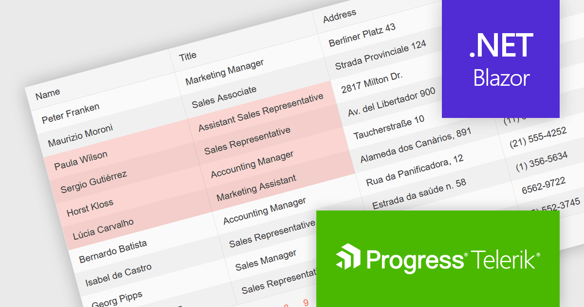
Telerik UI for Blazor is a comprehensive UI library that provides over 110 native Blazor components for building modern and feature-rich web applications. This professional-grade solution offers a complete set of components to satisfy all user interface requirements, saving time and effort in UI design.
The Telerik UI for Blazor v6.1.0 update (part of the 2024 Q3 release) enhances the grid component with a new SelectionMode feature, providing the ability to select single or multiple cells simultaneously. It supports intuitive selection methods via keyboard navigation and allows users to easily navigate and select either cells or rows. This feature enhances the user experience and makes the grid more flexible, enabling Blazor developers to offer functionality better suited to meet the complex data manipulation needs of modern web applications.
To see a full list of what's new in 2024 Q3 (v6.1.0), see our release notes.
Telerik UI for Blazor is licensed per developer and is available as a perpetual license with a one year support subscription, which is available in three tiers: Lite, Priority or Ultimate. See our Telerik UI for Blazor licensing page for full details.
Telerik UI for Blazor is available to buy in the following products:
電話: (888) 850 9911
Fax: +1 770 250 6199


