


公式サプライヤー
公式および認定ディストリビューターとして200社以上の開発元から正規ライセンスを直接ご提供いたします。
当社のすべてのブランドをご覧ください。

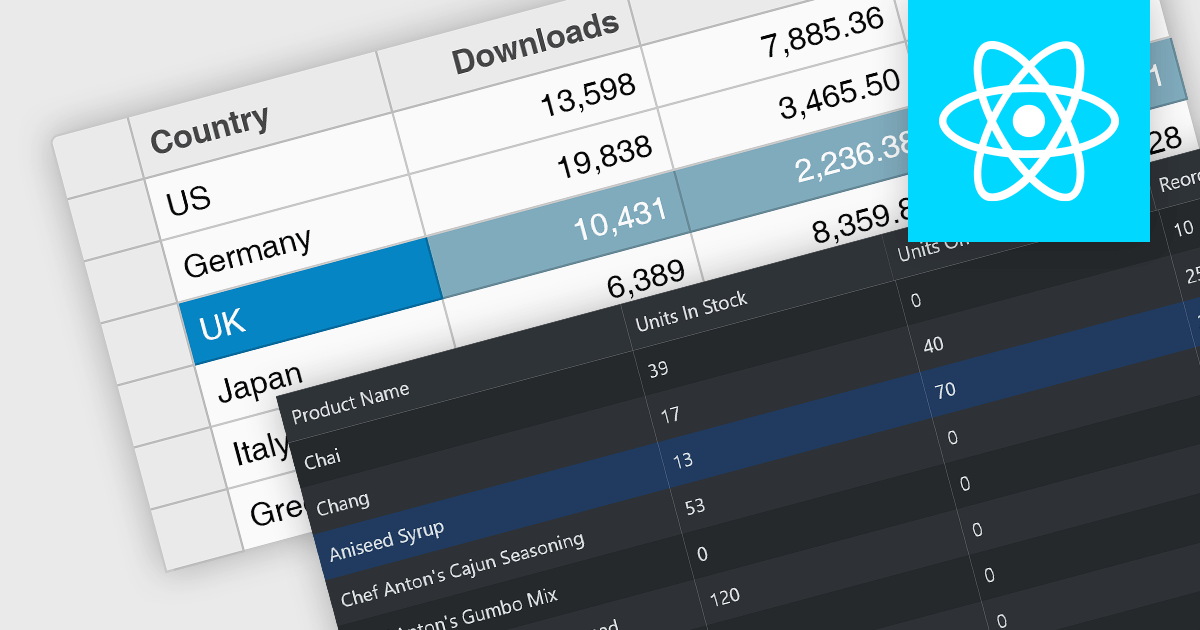
Infragistics Ignite UI for React is a comprehensive suite of enterprise-grade React UI components designed to accelerate the development of modern, high-performance web applications. Packed with features such as data grids, charts, gauges, and spreadsheets, it empowers developers to visualize and interact with complex data effortlessly. Ignite UI for React offers exceptional performance, customization options, and responsive design, facilitating the creation of engaging user experiences across various devices.
Infragistics Ignite UI Version 24.1 (Infragistics Ignite UI for React 18.6.0) adds a new Hierarchical Data Grid component, which provides a robust solution for visualizing and interacting with complex, hierarchical datasets. It empowers users to effortlessly expand or collapse parent rows to reveal detailed child grids, offering an intuitive, dynamic way to explore data at various levels of granularity. With rapid data binding, extensive customization options, and a comprehensive suite of functionality the Hierarchical Data Grid is a versatile tool for creating engaging and informative data-driven applications.
To see a full list of what's new in version 24.1 (18.6.0), see our release notes.
Infragistics Ignite UI for React is part of Infragistics Ignite UI which is licensed per developer and is available as a Perpetual License with a 1, 2 or 3 year support and maintenance subscription. See our Infragistics Ignite UI licensing page for full details.
Infragistics Ignite UI for React is available to buy in the following products:
Row selection functionality empowers users to interact with data grids by selecting individual or multiple rows, enabling efficient data manipulation and analysis. Users can perform actions on selected rows such as editing, deleting, exporting, or filtering data. This feature significantly enhances user experience and productivity by providing a direct and intuitive way to manage and process large datasets, facilitating tasks like batch updates, generating reports, or performing complex data operations based on user-defined criteria.
Several React grid controls offer row selection including:
For an in-depth analysis of features and price, visit our comparison of React grid controls.
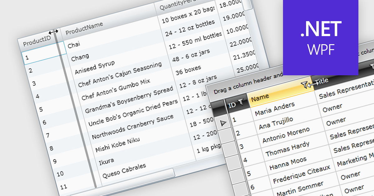
Column resizing in a datagrid empowers users to dynamically adjust column widths, enhancing data visibility and analysis. By dragging column boundaries, users can prioritize information, reveal hidden content, and improve readability. This flexibility accommodates diverse screen sizes, data volumes, and user preferences, ultimately optimizing the datagrid's usability for various tasks like data entry, reporting, and analysis.
Several WPF grid controls offer support for expanding and resizing columns including:
For an in-depth analysis of features and price, visit our WPF grid controls comparison.
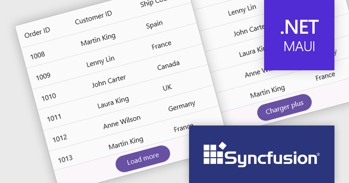
Syncfusion Essential Studio .NET MAUI, available as part of Syncfusion Essential Studio Enterprise, empowers developers with a comprehensive suite of native UI controls, data visualization tools, and performance optimizations for building modern, cross-platform mobile and desktop applications. This professional-grade toolkit leverages the power of C# and XAML, enabling rapid development of stunning and responsive experiences across diverse platforms.
The Syncfusion Essential Studio .NET MAUI 2024 Volume 2 SP1 (26.2.4) release improves the SfDataGrid by adding localization and support for applying formatting in a column with different cultures. This capability enables developers to create globally accessible and culturally sensitive applications by tailoring grid content and numerical displays to specific cultures, improving user experience and data interpretation accuracy across diverse user bases.
To see a full list of what's new in 2024 Volume 2 SP1 (26.2.4), see our release notes.
Syncfusion Essential Studio .NET MAUI is available as part of Syncfusion Essential Studio Enterprise which is licensed per developer starting with a Team License of up to five developers. It is available as a 12 Month Timed Subscription License which includes support and maintenance. See our Syncfusion Essential Studio Enterprise licensing page for full details.
Learn more on our Syncfusion Essential Studio .NET MAUI product page.

In datagrids, tooltips are on-demand informational popups that appear when hovering over a cell. They provide critical context for truncated content, enhancing usability by allowing users to view the full data point without sacrificing grid layout or requiring them to navigate elsewhere. This improves data comprehension and reduces the need for scrolling or resizing columns, leading to a more efficient user experience.
Several jQuery grid controls offer support for tooltips including:
For an in-depth analysis of features and price, visit our jQuery grid controls comparison.
電話: (888) 850 9911
Fax: +1 770 250 6199


