


公式サプライヤー
公式および認定ディストリビューターとして200社以上の開発元から正規ライセンスを直接ご提供いたします。
当社のすべてのブランドをご覧ください。
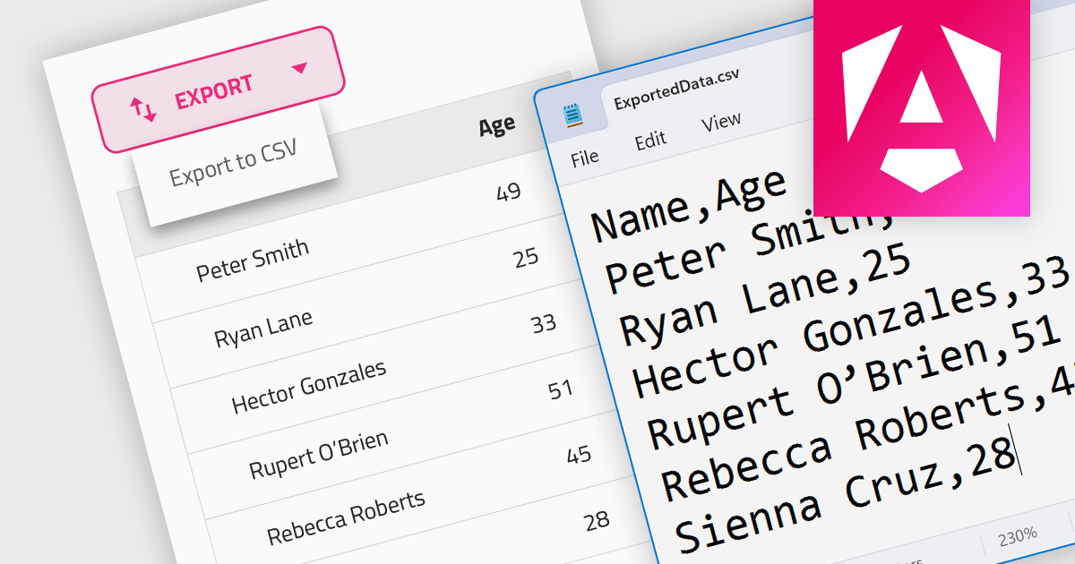
CSV export functionality in a grid control empowers users to seamlessly bridge the gap between interactive visualization and in-depth analysis. By exporting the displayed data as a readily importable CSV file, users gain immediate access to a familiar format compatible with diverse spreadsheet tools. This feature promotes efficient data extraction, facilitating further analysis, report generation, and data sharing, all directly from the convenience of the grid interface.
Several Angular grid controls support exporting to CSV, such as:
For an in-depth analysis of features and price, visit our Angular grid controls comparison.
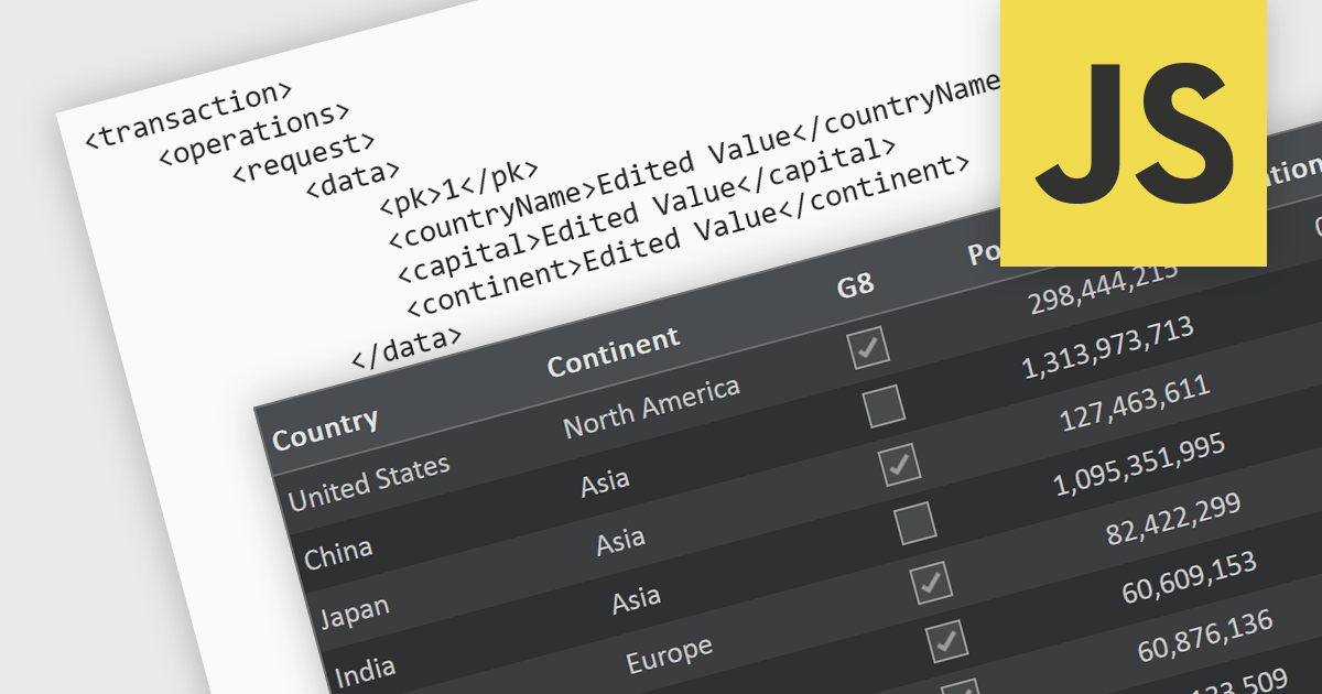
A RESTful API is a standardized interface that facilitates interaction between your application and remote data sources. Built on the principles of Representational State Transfer (REST), it leverages familiar HTTP verbs like GET, POST, PUT, and DELETE to perform CRUD operations (Create, Read, Update, Delete) on resources. This elegant and widely adopted approach ensures predictable communication, simplifies data access and manipulation, and empowers your applications to be dynamic, scalable, and efficient. In essence, RESTful APIs act as secure intermediaries, orchestrating a seamless flow of information between your application and the data it needs.
Several JavaScript grid controls support RESTful as a data source, such as:
For an in-depth analysis of features and price, visit our JavaScript grid comparison.
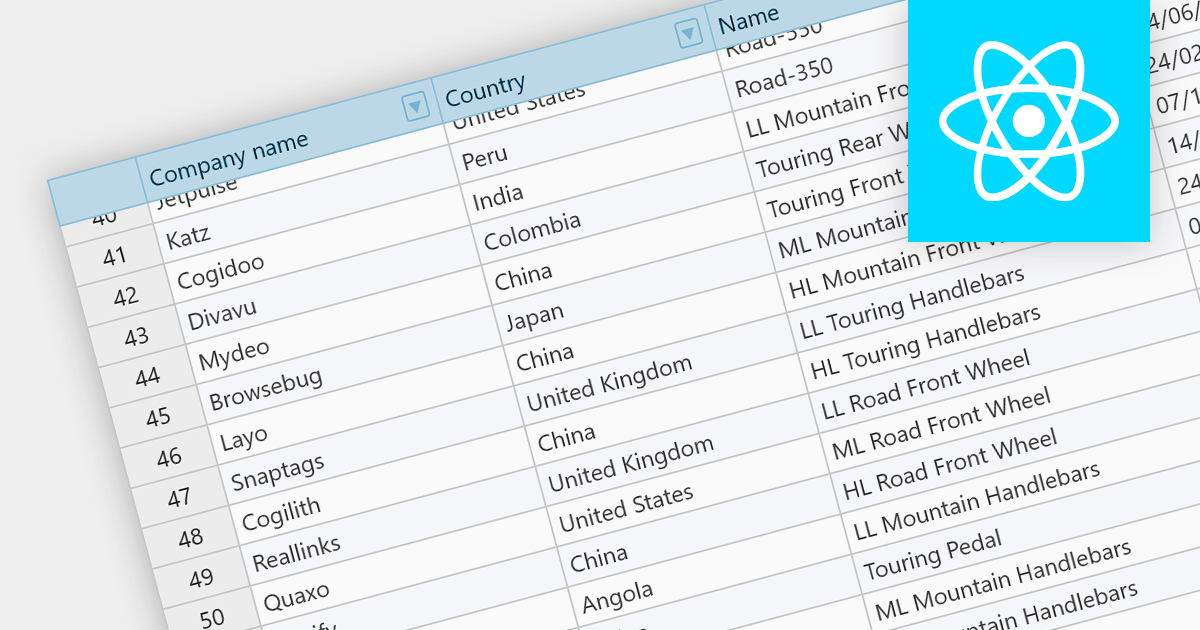
Fixed headers are a user interface element found in grids, particularly those managing large datasets. They comprise the top section of the grid, typically encompassing the row containing column labels and potentially additional rows with key information. Unlike the scrollable body of the grid, these headers remain anchored to the viewport, acting as a persistent reference point while users navigate through the data, thus improving user experience.
Several React grids support fixed headers including:
For an in-depth analysis of features and price, visit our React grids comparison.
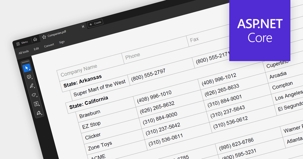
PDF export is a powerful feature in grid controls, allowing users to capture and share data presented in a readily accessible format. This functionality typically involves dedicated methods or settings within the grid, enabling seamless transformation of the displayed data into a structured PDF document. Users often have control over what sections and columns to export, along with formatting options like headers, fonts, and page layout. This flexibility makes PDF export ideal for generating printable reports, archiving snapshots of grid data, and distributing information beyond the confines of the application.
Several ASP.NET Core grids support exporting to PDF including:
For an in-depth analysis of features and price, visit our ASP.NET Core grids comparison.

DevExpress WinForms is a comprehensive suite of 190+ UI controls and development tools designed for building high-performance desktop applications. It offers a broad array of customizable controls, from data grids and ribbon interfaces to advanced charts, maps, and diagramming components. This empowers developers to rapidly create functionally rich applications, while adhering to accessibility guidelines and touch-enabled technology for modern Windows environments.
The DevExpress WinForms 23.2 release adds accessible keyboard navigation support to several controls, including the Ribbon, Backstage View, Recent Control, Data Grid, TreeList, CardView, Breadcrumb Editor, and Expression Editor. Users can navigate using arrow keys, keyboard shortcuts, and the Enter and Escape keys.
To see a full list of what's new in version 23.2, see our release notes.
DevExpress WinForms is licensed per developer and is available as a Perpetual License with a 12 month support and maintenance subscription. See our DevExpress WinForms licensing page for full details.
DevExpress WinForms is available to buy in the following products:
電話: (888) 850 9911
Fax: +1 770 250 6199


