


公式サプライヤー
公式および認定ディストリビューターとして200社以上の開発元から正規ライセンスを直接ご提供いたします。
当社のすべてのブランドをご覧ください。
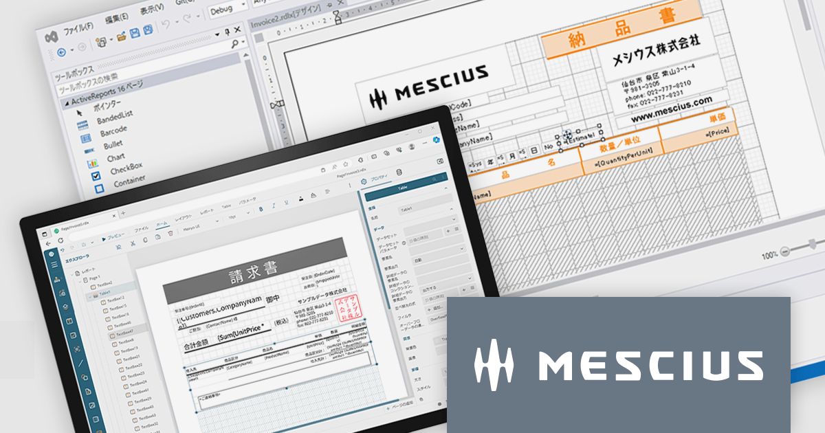
ActiveReportsは、帳票開発を強力に支援する.NET向け帳票ツールです。最新の 18.0J では、使いやすさとパフォーマンスがさらに向上し、直感的なデザイナや豊富な帳票出力形式、最新フレームワークへの対応を実現しています。開発効率を高めながら、高品質な帳票を短時間で作成できます。
2025年10月に予定されている Windows 10のサポート終了 に伴い、今後の業務システムは Windows 11対応 が求められます。ActiveReports for .NET 18.0J は最新環境への最適化が施されており、円滑な移行を実現するためには本バージョンへのアップグレードが必要です。旧バージョンのままでは、Windows 11での安定稼働が保証されませんのでご注意ください。
現在、ActiveReports for .NET 18.0J カムバックキャンペーンを実施中です。ActiveX版を含むすべての旧バージョンのActiveReportsユーザー様が対象として、特別価格でのアップグレードをご提供しております。お得なこの機会にぜひ最新環境へ移行し、今後の開発基盤を安心・安定の最新バージョンでご活用ください。
製品別のキャンペーン詳細およびご購入は、以下のリンクからご確認いただけます。
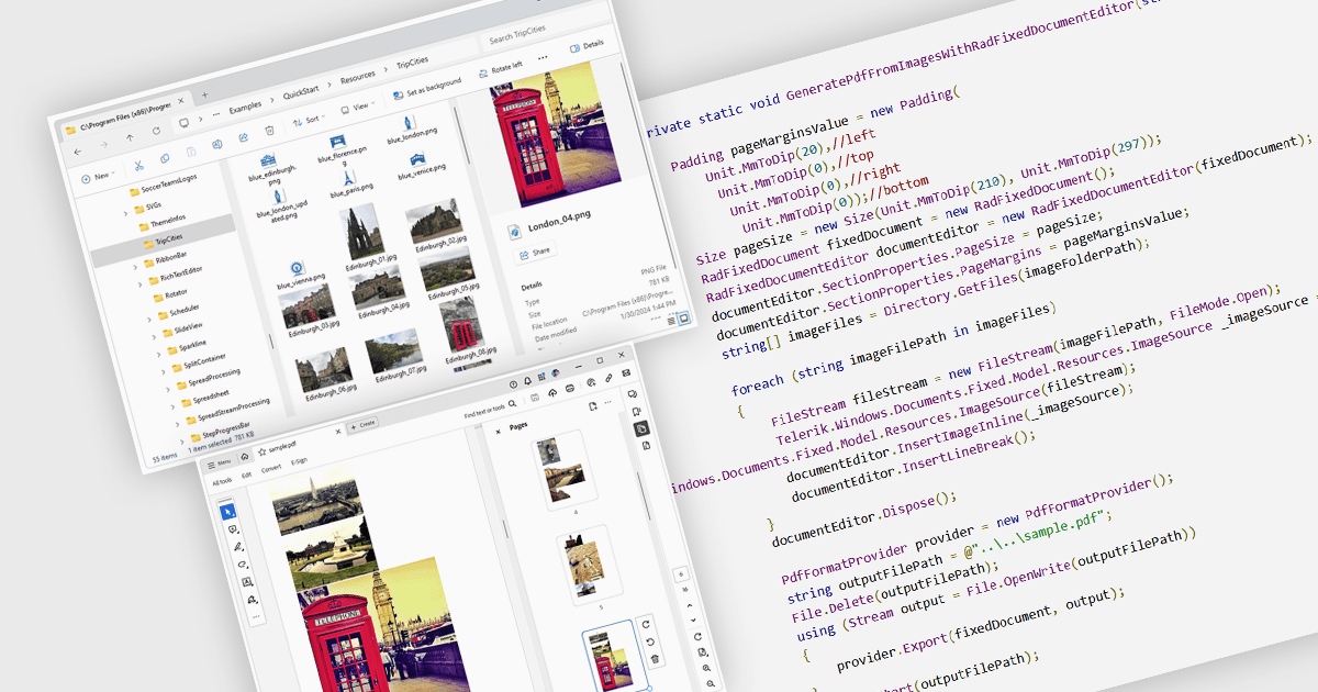
Image to PDF conversion is a common feature in document processing that enables the transformation of static image files, such as JPEG, PNG, or TIFF formats, into a Portable Document Format (PDF) file. PDFs support consistent rendering across different devices and platforms and are compact, secure, and easily viewable. This conversion is widely used to preserve visual content, including scanned documents, receipts, visual records, photos, or graphical outputs while making them easier to share, annotate, archive, or print in a universally accessible format.
Several WPF PDF components allow you to convert images to PDF, including:
For an in-depth analysis of features and price, visit our comparison of PDF components for WPF.
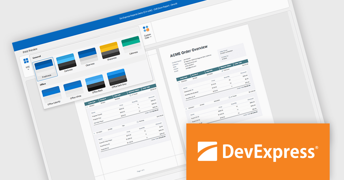
DevExpress DXperience is a comprehensive development suite that enables developers to build high-performance applications for Windows, Web, mobile, and tablet platforms using a unified set of controls and tools. It includes hundreds of desktop UI controls for WinForms, WPF, and reporting, as well as web UI controls for Blazor, ASP.NET, MVC, Core, Bootstrap Web Forms, JavaScript, Angular, React, Vue, and web reporting, plus productivity tools like XPO ORM and CodeRush for Visual Studio. With its extensive component library, DXperience accelerates development, ensures visually consistent and responsive interfaces, and is ideal for creating enterprise applications, data-driven web apps, dashboards, and reporting solutions.
DevExpress DXperience enhances application development with new app-wide themes and skins, allowing developers to apply a consistent, modern visual style across entire projects with minimal configuration. By providing professionally designed themes that align with Microsoft Office and Windows 11 aesthetics, along with built-in tools for customizing these designs, it improves the UI design process and reduces the need for manual styling. This enables developers to focus on functionality while delivering polished, cohesive user interfaces that improve usability and maintain a professional appearance across all application modules.
DevExpress DXperience is licensed per developer and is available as a Perpetual License with a 12 month support and maintenance subscription. See our DevExpress DXperience licensing page for full details.
For more information, visit our DevExpress DXperience product page.
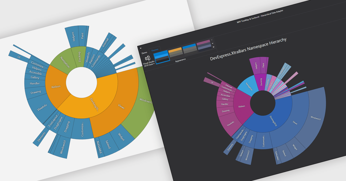
Chart themes provide a simple yet powerful way to standardize the appearance of charts by applying predefined color schemes, fonts, and styling options across visualizations. Instead of manually adjusting each element, users can quickly switch between themes to achieve a consistent, professional look that aligns with brand guidelines or presentation needs. The benefits include improving readability, enhancing accessibility - with inclusive color palettes - and ensuring visual consistency across multiple charts or entire dashboards. Chart themes improve the process of creating impactful, audience-ready data visualizations.
Several .NET WPF chart components offer the ability to add themes, including:
For an in-depth analysis of features and price, visit our .NET WPF charts comparison.
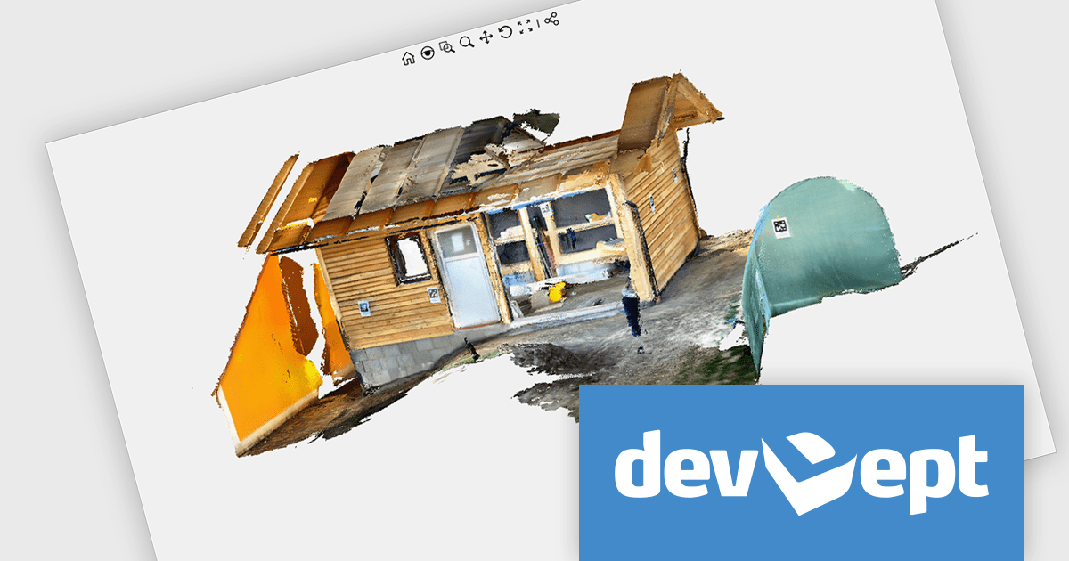
Eyeshot by devDept is a comprehensive 3D graphics toolkit designed for .NET developers building engineering and CAD (Computer-Aided Design) applications. It offers a robust set of components for creating, editing, and rendering complex 2D and 3D geometry directly within Windows Forms and WPF environments. With support for advanced modeling features, viewport controls, and industry-standard file formats, Eyeshot simplifies the integration of interactive graphics into technical software. It is well-suited for developers working in areas like mechanical design, architecture, and simulation who need high-performance rendering and precise modeling capabilities.
The Eyeshot 2025.3 update adds preview support for the E57 file format through its new 'ReadE57' class, allowing developers to import data captured by 3D imaging systems such as laser scanners. E57 is a compact, vendor-neutral format that stores rich 3D content, including point clouds, images, and associated metadata. This new functionality gives developers greater flexibility when working with real-world scan data, making it easier to integrate 3D captures into engineering, architecture, and visualization applications.
To see a full list of what's new in version 2025.3, see our release notes.
Eyeshot is licensed per developer and is available as an annual license, with either Lite or Priority support. See our licensing pages for Eyeshot Pro, Eyeshot Ultimate, and Eyeshot Fem for full details.
Eyeshot is available to buy in the following products:
電話: (888) 850 9911
Fax: +1 770 250 6199


