


公式サプライヤー
公式および認定ディストリビューターとして200社以上の開発元から正規ライセンスを直接ご提供いたします。
当社のすべてのブランドをご覧ください。
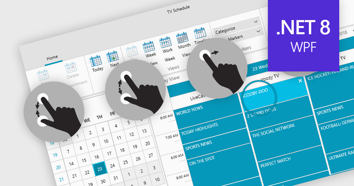
Data editors with touch support revolutionize user interaction by enabling intuitive gestures, taps, and swipes. This fosters a seamless experience, particularly on touchscreens found in smartphones, tablets, and even touch-enabled laptops. Developers can leverage this functionality to create applications with effortless navigation, data manipulation, and command execution through touch. This broader accessibility empowers a wider range of users, enhancing usability and fostering a more engaging and efficient interaction that capitalizes on the hardware capabilities of modern devices.
Many .NET 8 WPF collections contain Data Editors with Touch Support including:
For an in-depth analysis of features and price, visit our comparison of .NET 8 WPF Data Editors.
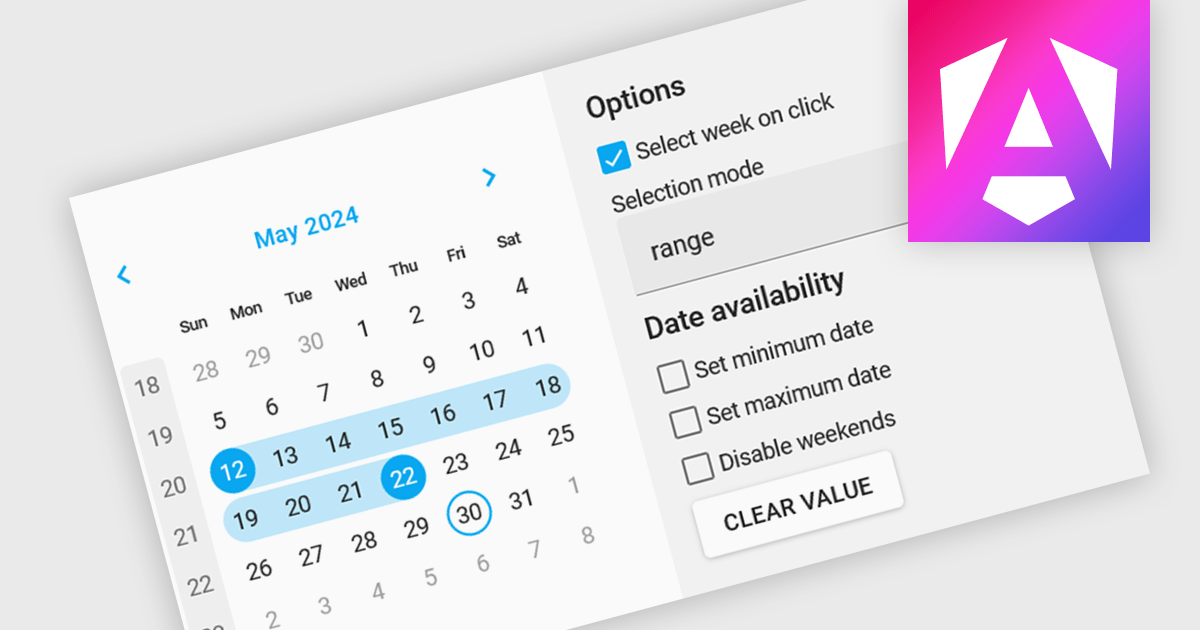
Calendar editing components provide a specialized way to interact with date and time data within the editor. These controls replace the standard input field with a visual calendar interface, allowing developers to offer a more intuitive and user-friendly experience for date selection and modification. This can significantly improve data entry accuracy and efficiency, especially when dealing with large datasets or complex date formats.
Several Angular data editor collections offer calendar editor controls including:
For an in-depth analysis of features and price, visit our Angular Data Editors comparison.
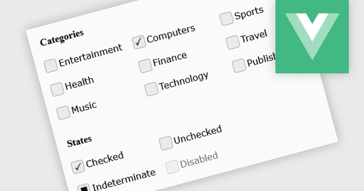
A checkbox data editor is a specific user interface element designed to efficiently manage boolean data (true/false values). It provides a clear and intuitive way for users to edit single binary flags within their data, improving data entry accuracy and streamlining the process compared to manually manipulating text fields. This boosts the user experience by allowing for quick choices, particularly when dealing with features like filtering preferences, selecting multiple items from a list, or toggling settings.
Several Vue.js components offer checkbox data editors, including:
For an in-depth analysis of features and price, visit our comparison of Vue.js data editors.
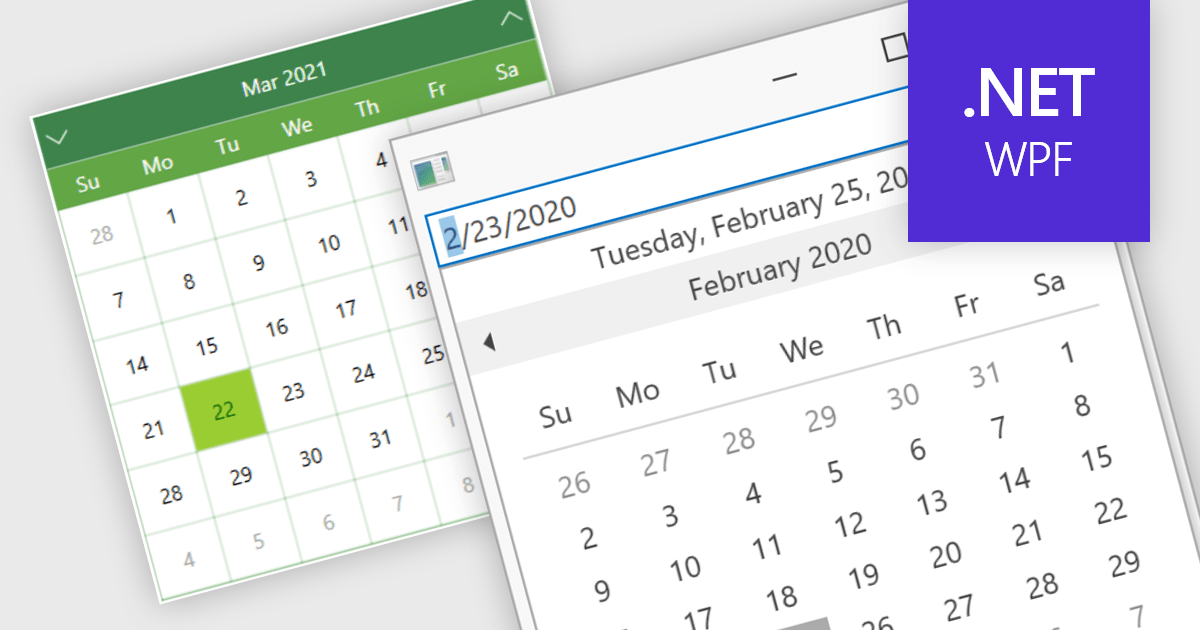
Calendar data entry components provide a familiar interface that allows users to visually navigate through days, months, and years, making it easier to find specific dates. They can also support features like multi-date selection or blackout dates for unavailable options. This functionality improves data entry accuracy and reduces the need for manual code to manage date operations, streamlining development workflows and potentially reducing errors.
Many .NET 8 WPF data editor collections contain calendar functionality including:
For an in-depth analysis of features and price, visit our comparison of .NET 8 WPF Data Editors.
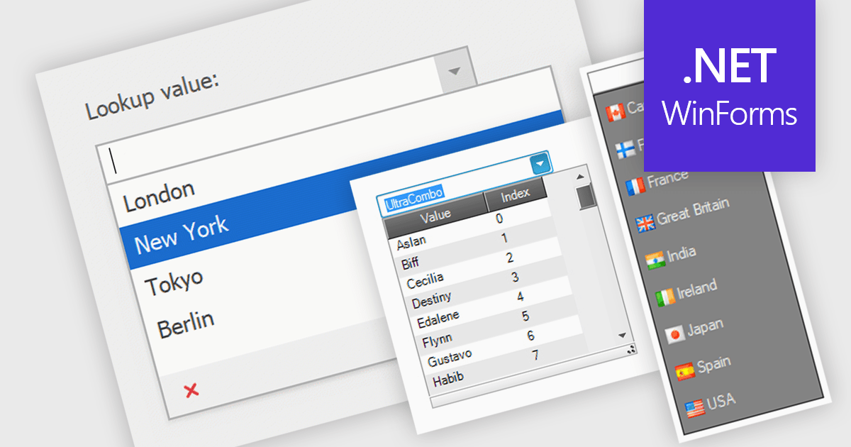
Comboboxes are user interface elements that provide a flexible input experience. They combine a text field with a drop-down list, allowing users to either choose a value from the pre-defined options or enter their own custom value directly into the field. This functionality makes them particularly useful for selecting from large datasets or enabling data entry that may not always have a perfect match within a predefined list.
Several WinForms data editor collections offer combobox components including:
For an in-depth analysis of features and price, visit our WinForms Data Editors comparison.
電話: (888) 850 9911
Fax: +1 770 250 6199


