


公式サプライヤー
公式および認定ディストリビューターとして200社以上の開発元から正規ライセンスを直接ご提供いたします。
当社のすべてのブランドをご覧ください。
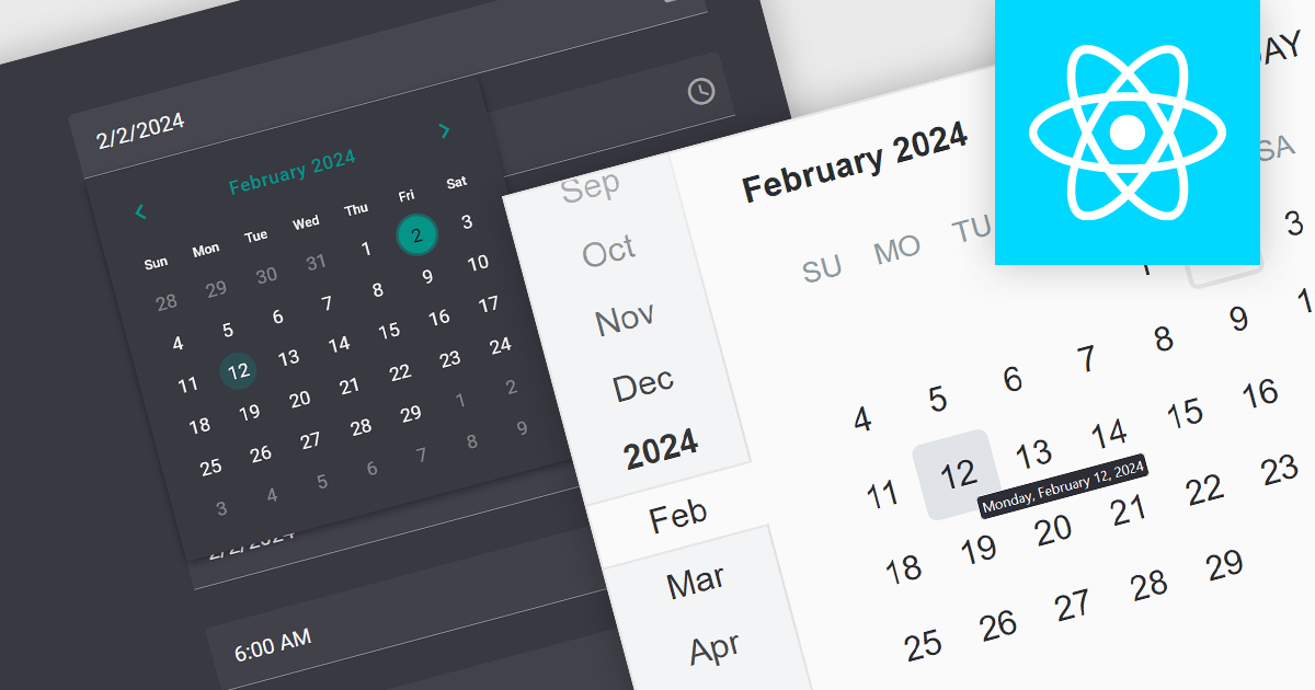
A date editor control is a user interface element designed for selecting and entering dates. It typically combines a text field for manual input with a calendar popup for visual selection. Beyond basic date picking, many controls offer features like time selection, range definition, drop-down lists for pre-defined dates, and even input masks for enforcing specific date formats. Commonly found in applications like forms, booking systems, and calendars, date editor controls streamline date input, improving user experience and data accuracy.
Several React data editor collections provide date editors including:
For an in-depth analysis of features and price, visit our React Data Editors comparison.
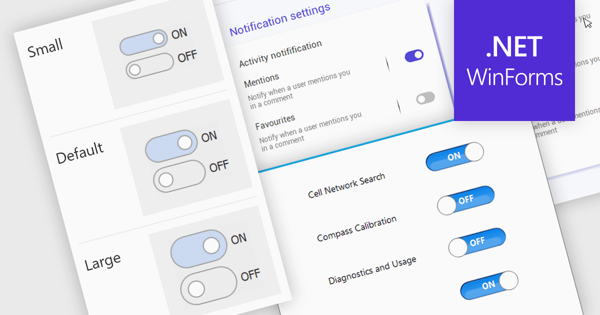
A toggle switch control is a user interface element that allows the rapid, binary (on/off) selection of a setting. It functions like a physical switch, offering a clear visual representation of the chosen state and triggering an immediate change through user interaction. Its simplicity and immediacy make it ideal for controlling settings, activating features, and toggling preferences within digital interfaces.
Several WinForms data editor collections offer toggle switch controls including:
For an in-depth analysis of features and price, visit our comparison of WinForms Data Editors.
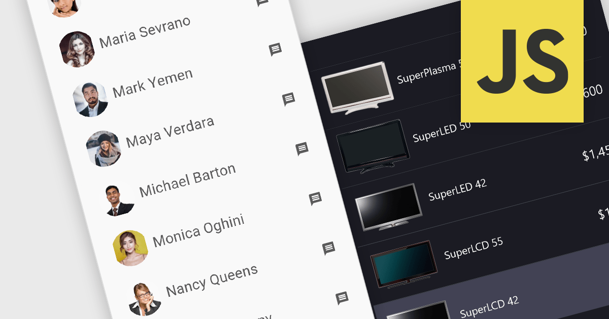
Image listboxes transcend the limitations of traditional listboxes by incorporating image previews alongside textual labels. This creates an intuitive browsing experience, enabling users to quickly identify and select an option with visual cues. This is particularly useful for applications where visual selection enhances the user experience, such as choosing products in an e-commerce platform or selecting avatars in user profiles. It combines the clarity of images with the efficiency of a listbox to streamline selection processes.
Several JavaScript data editor collections provide image listbox capabilities including:
For an in-depth analysis of features and price, visit our comparison of JavaScript Data Editor components.

Syncfusion Essential Studio .NET MAUI, available as part of Syncfusion Essential Studio Enterprise, empowers developers with a comprehensive suite of native UI controls, data visualization tools, and performance optimizations for building modern, cross-platform mobile and desktop applications. This professional-grade toolkit leverages the power of C# and XAML, enabling rapid development of stunning and responsive experiences across diverse platforms.
The Syncfusion Essential Studio .NET MAUI 2023 Volume 4 (24.1.41) release adds a new Date Time Picker component. This lets users effortlessly select dates, times, or both, and boasts impressive features like different picker modes (inline, popup, and relative), extensive date and time formatting options, minimum and maximum date restrictions, and granular customization of headers, columns, footers, and selection views. This versatile tool helps you build intuitive and visually appealing UIs for capturing date and time data with ease.
To see a full list of what's new in version 2023 Volume 4 (24.1.41), see our release notes.
Syncfusion Essential Studio .NET MAUI is available as part of Syncfusion Essential Studio Enterprise which is licensed per developer starting with a Team License of up to five developers. It is available as a 12 Month Timed Subscription License which includes support and maintenance. See our Syncfusion Essential Studio Enterprise licensing page for full details.
For more information, visit our Syncfusion Essential Studio .NET MAUI product page.
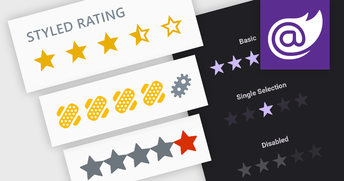
Rating controls are interactive tools used to measure user satisfaction with content, services, or specific features. They allow users to visually convey their opinions through scales, stars, or other predefined metrics. These systems often display average ratings alongside individual selections, providing valuable insights for improvement and personalized user experiences. Rating controls serve as a bridge between users and creators, fostering dialogue and informing data-driven decisions.
Several Blazor data editor collections provide rating controls including:
For an in-depth analysis of features and price, visit our Blazor Data Editors comparison.
電話: (888) 850 9911
Fax: +1 770 250 6199


