


公式サプライヤー
公式および認定ディストリビューターとして200社以上の開発元から正規ライセンスを直接ご提供いたします。
当社のすべてのブランドをご覧ください。
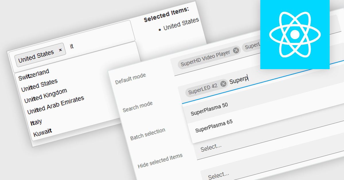
Token boxes, also known as token input controls, are user interface elements designed to streamline data entry for multiple values. They allow users to input, manage, and manipulate discrete pieces of data (tokens) within a single form field. This enhances user experience by facilitating tagging, categorization, and selection of multiple items, while providing developers with a robust tool for intuitive interfaces. The benefits include improved clarity through visual separation of values, efficient data handling, and ease of use in applications like search filters, email address inputs, and tagging systems.
Many React data editor collections contain token box / input controls including:
For an in-depth analysis of features and price, visit our comparison of React Data Editors.
Syncfusion Essential Studio ASP.NET MVC, available as part of Syncfusion Essential Studio Enterprise, is a comprehensive suite of web UI controls that empowers developers to craft rich, interactive ASP.NET MVC applications. Backed by the lightweight and modular Essential JS 2 library, it offers over 80 components ranging from data grids and charts to schedulers and pivot grids, while ensuring a seamless integration with the MVC framework for an efficient development experience.
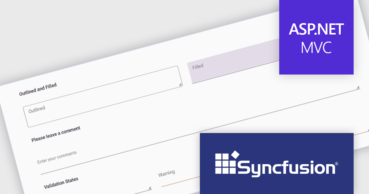
The Syncfusion Essential Studio ASP.NET MVC 2024 Volume 2 (26.1.35) release introduces the production-ready TextArea component. This enhanced control streamlines user input for multi-line text, perfect for capturing comments, messages, or any lengthy content. Beyond core functionality, the Syncfusion TextArea offers a rich feature set including intuitive icons, clear floating labels, flexible sizing options, and visual validation cues to empower a more user-friendly and informative data collection experience.
To see a full list of what's new in 2024 Volume 2 (26.1.35), see our release notes.
Syncfusion Essential Studio ASP.NET MVC is available as part of Syncfusion Essential Studio Enterprise which is licensed per developer starting with a Team License of up to five developers. It is available as a 12 Month Timed Subscription License which includes support and maintenance. See our Syncfusion Essential Studio Enterprise licensing page for full details.
Learn more on our Syncfusion Essential Studio ASP.NET MVC product page.
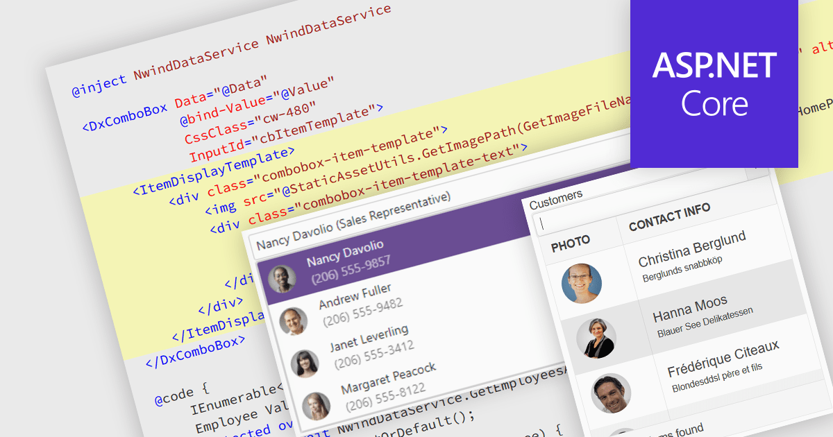
An image combobox is a custom UI component that combines a traditional dropdown menu with the ability to display an image alongside each item. Image comboboxes can enhance user experience by providing a more intuitive way to identify and select options, especially for items that benefit from visual representation. This approach can be particularly useful for non-text-based data or for catering to users who prefer visual cues. Image comboboxes are valuable for tasks like selecting product variations based on color or choosing countries with a flag icons.
Several ASP.NET Core data editor controls support image combobox functionality, including:
For an in-depth analysis of features and price, visit our ASP.NET Core data editors comparison.
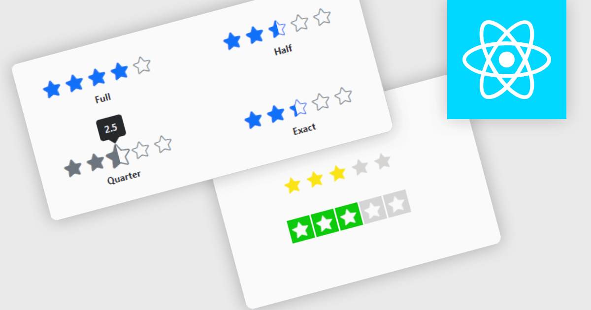
Rating controls for React are user interface components designed to allow users to input and edit rating values, typically represented by stars, numeric values, or other graphical symbols. These controls are essential in applications where user feedback or rating is required, such as e-commerce sites, review platforms, and survey forms. They provide an intuitive, interactive way for users to submit ratings, ensuring that the data is captured accurately and efficiently. These controls often come with customization options to fit the application's design and can handle various events and validations to enhance the user experience and data integrity.
Several React data editor collections offer Rating controls including:
For an in-depth analysis of features and price, visit our comparison of React data editors.
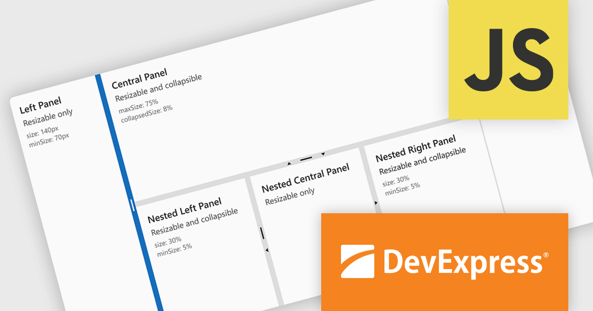
DevExtreme Complete by DevExpress is a collection of high-performance, pre-built UI components designed for web and mobile app development. It offers a rich set of widgets including data grids, charts, editors, and navigation tools that are responsive and work seamlessly across different browsers and devices. DevExtreme Complete allows developers to build feature-rich and user-friendly applications for modern web experiences.
DevExtreme Complete 24.1 adds a new splitter component. This powerful addition allows you to create flexible page layouts with resizable and collapsible panes. Panes can be oriented horizontally or vertically and can contain various content types, including HTML and other DevExtreme components. The splitter offers customization options for handle size, appearance, and keyboard accessibility, making it a powerful tool for building adaptable web applications.
To see a full list of what's new in version 24.1, see our release notes.
DevExtreme Complete is licensed per developer and is available as a Perpetual License with a 12 month support and maintenance subscription. We can supply any DevExtreme Complete license including new subscriptions, subscription renewals, expired subscription renewals, and additional licenses. See our DevExtreme Complete licensing page for full details.
DevExtreme Complete is available to buy in the following products:
電話: (888) 850 9911
Fax: +1 770 250 6199


