


公式サプライヤー
公式および認定ディストリビューターとして200社以上の開発元から正規ライセンスを直接ご提供いたします。
当社のすべてのブランドをご覧ください。
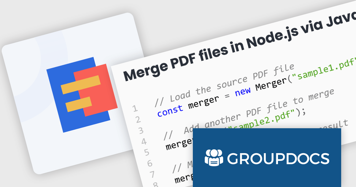
GroupDocs.Merger for Node.js via Java empowers developers to seamlessly integrate document merging and splitting capabilities into their Node.js applications. It enables Node.js applications to leverage the robust document processing features of the GroupDocs.Merger Java library, eliminating the need for developers to rewrite merging, saving development time and resources.
This library offers a powerful solution for enhancing document management in Node.js applications. Users can benefit from its broad format support for effortless integration and merging of diverse document types including Word, Excel, PowerPoint, Visio, PDF, OpenDocument, image, and archive formats. It empowers developers to split large documents, reorder or replace pages, manage document protection, and even render documents as images. These functionalities streamline document organization, improve collaboration processes, and provide greater flexibility in handling various document needs within Node.js applications.
GroupDocs.Merger for Node.js via Java is offered as Developer Small Business, Developer OEM, Site Small Business, and Site OEM licenses catering to a range of business needs. Licenses are perpetual, and include 1 year of support and maintenance. Subscription renewals are also available. See our GroupDocs.Merger for Node.js via Java licensing page for full details.
GroupDocs.Merger for Node.js via Java is available in the following products:
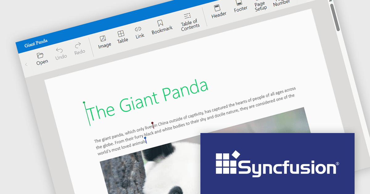
Syncfusion Essential Studio JavaScript, available as part of Syncfusion Essential Studio Enterprise, is a comprehensive UI library offering over 80 high-performance, lightweight, and responsive components to transform your web apps. Built from scratch with TypeScript, it boasts modularity and touch-friendliness, letting you pick and choose specific features while ensuring smooth mobile interaction. With rich themes, global accessibility features, and extensive documentation, it powers everything from basic buttons to interactive charts and data grids, simplifying front-end development across JavaScript, Angular, React, and Vue.
Syncfusion Essential Studio JavaScript 2024 Volume 1 (25.1.35) introduces real-time collaborative editing for the Word Processor component. This enables multiple users to co-author documents simultaneously, with changes visible to all participants as they happen. Collaborative editing streamlines the document workflow and fosters improved teamwork.
To see a full list of what's new in version 2024 Volume 1 (25.1.35), see our release notes.
Syncfusion Essential Studio JavaScript is available as part of Syncfusion Essential Studio Enterprise which is licensed per developer starting with a Team License of up to five developers. It is available as a 12 Month Timed Subscription License which includes support and maintenance. See our Syncfusion Essential Studio Enterprise licensing page for full details.
For more information, visit our Syncfusion Essential Studio JavaScript product page.
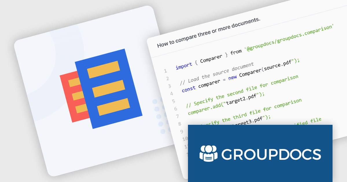
GroupDocs.Comparison for Node.js via Java is a software development library that empowers developers using Node.js to integrate document comparison functionality into their applications. It acts as a bridge between the Node.js environment and the core GroupDocs.Comparison engine, written in Java. This allows developers to seamlessly leverage the robust comparison capabilities within their Node.js projects.
The library streamlines the process of identifying changes between various document formats, including Microsoft Office files (Word, Excel, PowerPoint), OpenDocument formats, PDFs, images, and more. Developers can use it to generate detailed reports highlighting differences at the paragraph, word, and character levels. It can also detect changes in styling and formatting, providing a comprehensive view of document revisions. These functionalities make GroupDocs.Comparison for Node.js via Java valuable for applications like version control systems, plagiarism checkers, and document review workflows.
GroupDocs.Comparison for Node.js via Java is offered as Developer Small Business, Developer OEM, Site Small Business, and Site OEM licenses catering to a range of business needs. Licenses are perpetual, and include 1 year of support and maintenance. Subscription renewals are also available. See our GroupDocs.Comparison for Node.js via Java licensing page for full details.
GroupDocs.Comparison for Node.js via Java is available in the following products:
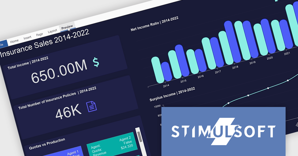
Stimulsoft Dashboards.PYTHON is a new data visualization tool specifically designed for building interactive dashboards within Python applications. It combines a client-side JavaScript engine for data processing with a designer component to craft dashboards and a viewer for displaying them. This empowers developers to create clear and informative visual representations of data directly within their Python projects.
Developers can leverage a rich set of pre-built widgets to construct dashboards that display data through charts, gauges, and other informative elements. These dashboards can be interactive, enabling users to filter data, drill down into specific details, and gain a deeper understanding of the information at hand. This makes Stimulsoft Dashboards.PYTHON a valuable tool for a wide range of use cases, from business intelligence and financial analysis to scientific data visualization and project management.
Stimulsoft Dashboards.PYTHON is licensed per developer and is available as a perpetual license with 1 year support and maintenance. See our Stimulsoft Dashboards.PYTHON licensing page for full details.
Stimulsoft Dashboards.PYTHON is available in the following products:
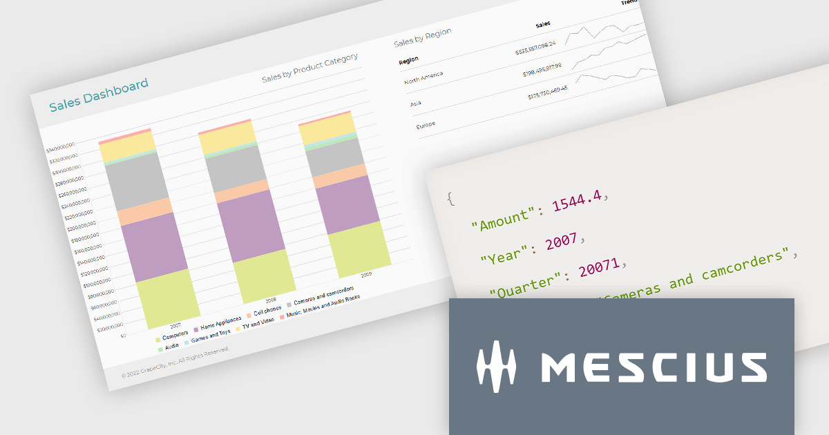
ActiveReportsJS is a reporting tool for web applications that allows developers and report authors to easily design and display reports within their applications. With a wide range of features, such as drill-down, runtime data filtering, and parameter-driven reports, as well as compatibility with popular frameworks, ActiveReportsJS simplifies the process of creating and managing reports.
In this blog post, MESCIUS Product Engineer Sergey Abakumoff demonstrates five performance tips that you can use when, for example, you need to bind a report to large volumes of data to display summary reports in a dashboard:
A demo project is included to demonstrate each tip in action.
Read the full blog to learn these performance-boosting tips.
ActiveReportsJS is licensed on an annual subscription or perpetual basis and is available as a Single Deployment License for non-commercial use, and as a Single Domain License or Unlimited Domain License for commercial and/or SaaS use. See our ActiveReportsJS licensing page for full details.
For more information, visit our ActiveReportsJS product page.
電話: (888) 850 9911
Fax: +1 770 250 6199


